

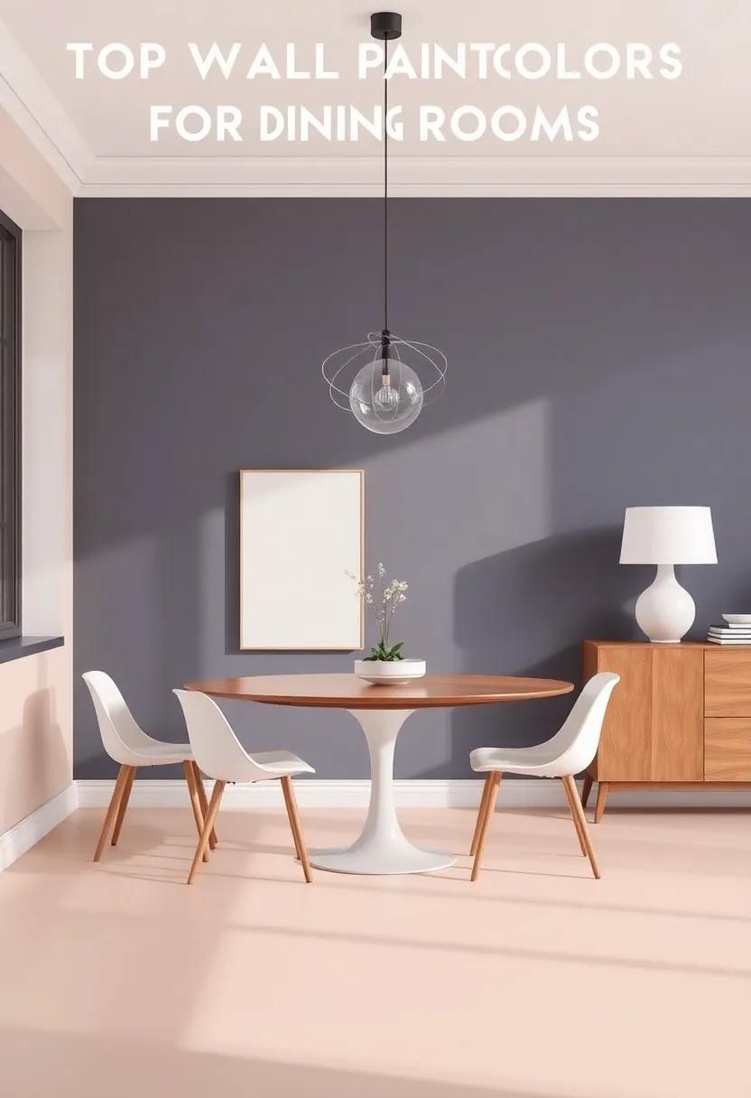
The dining room is more than just a space to eat; it’s a haven for gatherings, celebrations, and intimate conversations.The right wall color can transform this room from a simple eating area into a warm and inviting sanctuary that fosters connection and comfort. As we delve into the world of wall paint colors, we’ll explore how hues can influence mood and ambiance, whether you’re hosting a festive dinner party or enjoying a quiet meal with loved ones. From calming neutrals to vibrant accents, join us on this journey to discover the top wall paint colors that will elevate your dining room’s atmosphere and create a setting that truly feels like home.
Bright Whites: Elevating Your Dining Room with Light and Airy Shades
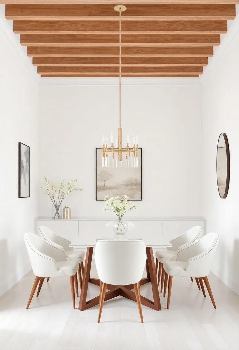
Incorporating luminous whites into your dining room can transform the space, making it feel expansive and inviting. These shades aren’t merely about brightness; they reflect light and can elevate the overall ambiance, creating a serene backdrop that encourages conversation and connection. Consider using whites with warm undertones like ivory and cream for a cozy feel, or opt for the crispness of pure white to achieve a modern edge. pairing these hues with contrasting dark furniture or vibrant accents can create a striking visual balance, while still maintaining an airy atmosphere.
To enhance the effect of light shades, focus on the elements within the dining room. Use mirrors to amplify natural light and reflect the luminous walls, giving the illusion of a larger space. Pay attention to your decor and textiles—think light drapery, soft table linens, and metallic accents that catch the light. A well-planned color scheme can also include elements like:
- Soft pastels for an elegant touch
- Nature-inspired accents for warmth
- Metallics to add sophistication
When selecting your white paint, consider the natural lighting conditions in your dining room. The color can appear differently throughout the day, making it essential to test samples in various light scenarios. To simplify your decision-making process, here’s a speedy reference table of popular light paint options:
| Shade | undertone | Effect |
|---|---|---|
| Snowy White | Cool | Fresh & Crisp |
| Soft Cream | Warm | Cozy & Inviting |
| Almond Milk | Neutral | Balance & Serenity |
Warm Neutrals: Creating a Cozy and Inviting dining Space
Transforming your dining space into a haven of warmth and comfort begins with the right choice of colors. Warm neutrals—shades like beige, taupe, and soft greys—create an enveloping atmosphere that encourages lively conversations and shared meals. These colors promote a sense of calm while still allowing you to infuse personality into the room through decor and furnishings. Pairing your walls with natural wood tones and textured fabrics not onyl enhances the feeling of coziness but also creates an organic flow that draws guests in. Experimenting with different shades of these neutrals can lead to a subtle yet dynamic backdrop for your dining experiences.
To further enrich your dining area, consider incorporating various materials that complement warm neutrals. Textiles such as soft linens and plush pillows can add layers of comfort, while elements like copper or gold accents bring in a touch of sophistication. Utilize the following elements to effectively balance and highlight your cozy dining space:
- Layered Lighting: Implementing dimmable overhead lights, pendant lamps, and candles to enhance the atmosphere.
- Natural Elements: Incorporating indoor plants or flower arrangements that harmonize with your color scheme.
- Mix Textures: Combining smooth ceramics, woven wicker, and soft fabrics to create tactile interest.
For those looking to refine their choices further, here’s a simple table showcasing popular warm neutral tones and their psychological effects:
| Color | Hex Code | Psychological Effect |
|---|---|---|
| Beige | #F5F5DC | Warmth and comfort |
| Taupe | #BDB1A8 | Stability and sophistication |
| Soft Gray | #D3D3D3 | Calm and relaxation |
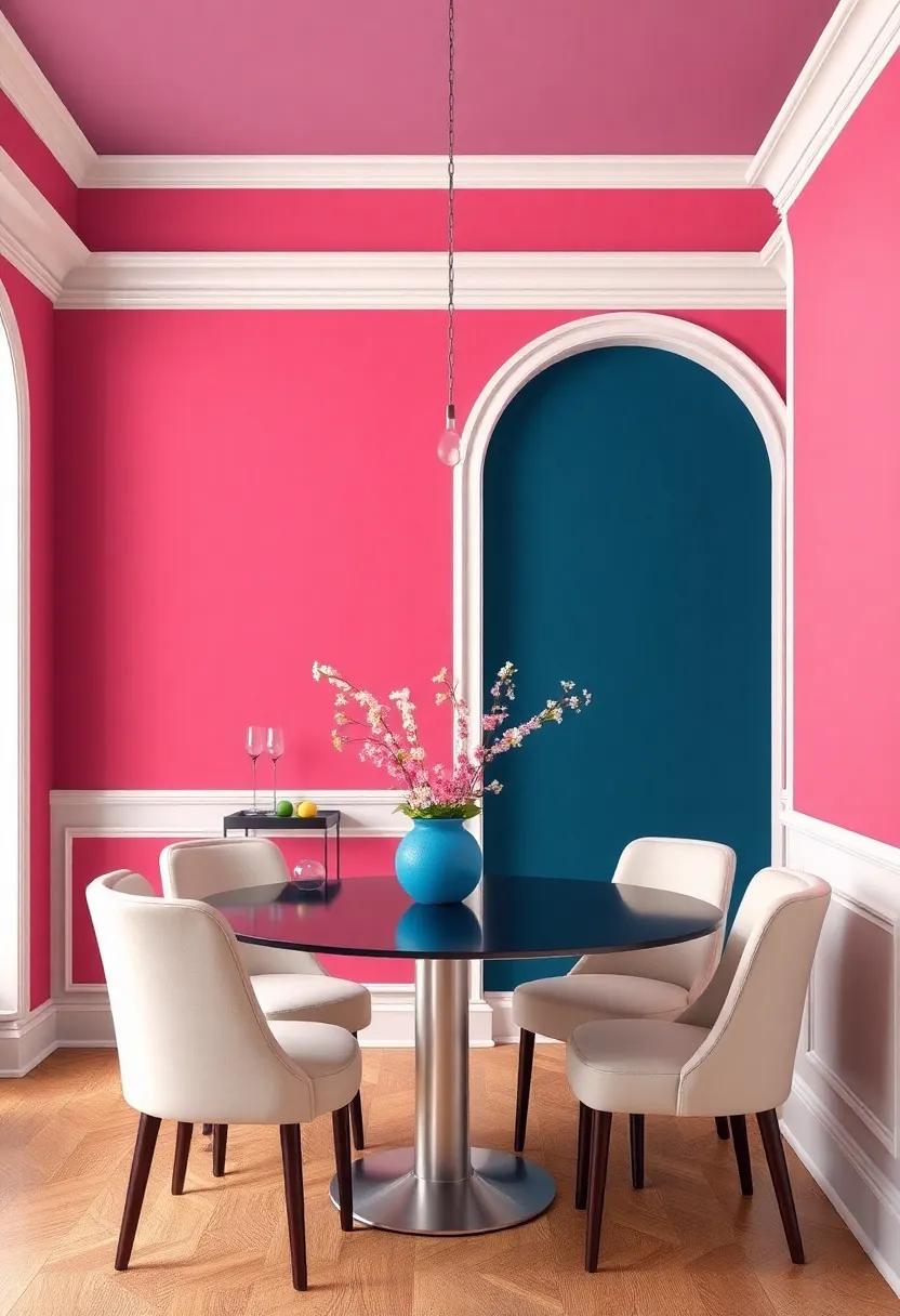
Bold Blues: Infusing Serenity and Elegance into Your Dining Experience
The deep, calming shades of blue can transform your dining room into a sanctuary of tranquility. Soft navy or gentle sky blue can evoke a sense of serenity while still radiating sophistication. When paired with white trim or natural wood accents, these colors enhance the elegance within the room. Consider incorporating decorative elements such as artwork or vases in complementary shades to create a harmonious balance that invites guests to partake in leisurely meals and conversations.
To elevate the atmosphere even further, bold azure or teal can act as a stunning focal point, drawing attention to architectural features or a beautifully set table. Textured fabrics, like velvet cushions or linen tablecloths in shades of blue, can add a layer of depth, enhancing both comfort and style. Utilize the following elements to maximize the impact of blue within your dining space:
- Accent Walls: Choose a single wall to paint a bold shade while keeping the other walls neutral.
- Artwork: Select pieces that incorporate shades of blue to tie the room together.
- Lighting: Opt for soft lighting fixtures that warm up blue tones, enhancing their serene quality.
Earthy Greens: Bringing Nature indoors for a Tranquil Atmosphere
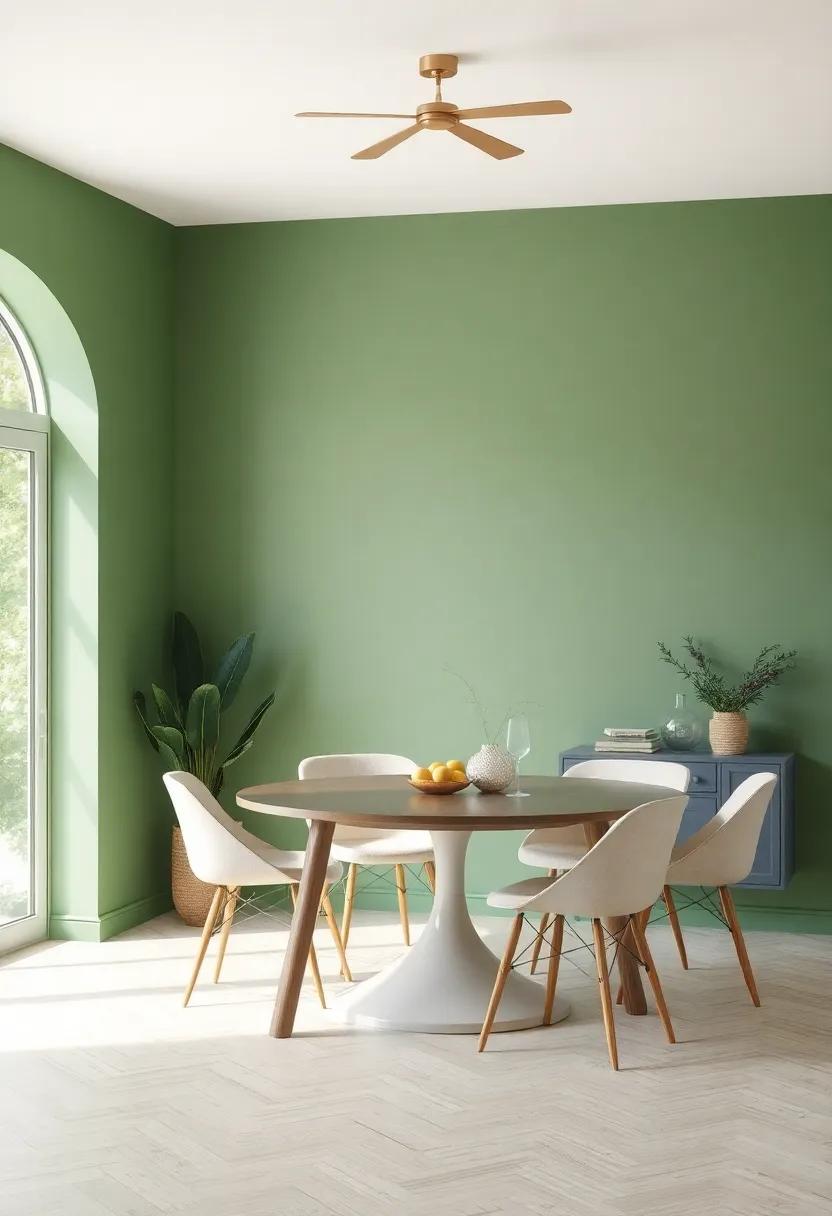
Incorporating earthy greens into your dining room transforms the space into a serene oasis, inviting relaxation and a closer connection to nature. These soothing hues evoke the essence of lush landscapes, instantly calming the senses and promoting tranquility during meals shared with loved ones. From muted olives to deep forest shades, earthy greens can establish a harmonious balance, allowing your dining area to feel both grounded and revitalizing. Consider these key shades for your project:
- Olive Green: Versatile and sophisticated; pairs beautifully with neutral decor.
- Mint Green: Adds a refreshing note without overwhelming other elements.
- Fern Green: Creates a vibrant yet earthy backdrop that complements wooden furniture.
A accomplished palette not only enhances aesthetics but also fosters meaningful experiences. When combined with natural elements such as wooden tables or potted plants, earthy greens create a seamless transition from the outdoor world into your home. Furthermore, these tones work in harmony with various textures—think cozy linens, rustic ceramics, and serene lighting, all contributing to a warm, inviting atmosphere.Below is a quick comparison of how these shades can reshape your dining experience:
| Shade | Effect | Best Pairing |
|---|---|---|
| Olive Green | Warmth and sophistication | Earthy browns and whites |
| Mint Green | Freshness and lightness | Light woods and soft pastels |
| Fern Green | Vibrancy and energy | Greys and darker shades |
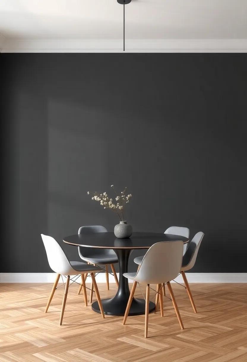
Subtle Grays: The Versatility of Gray in Modern Dining Room Design
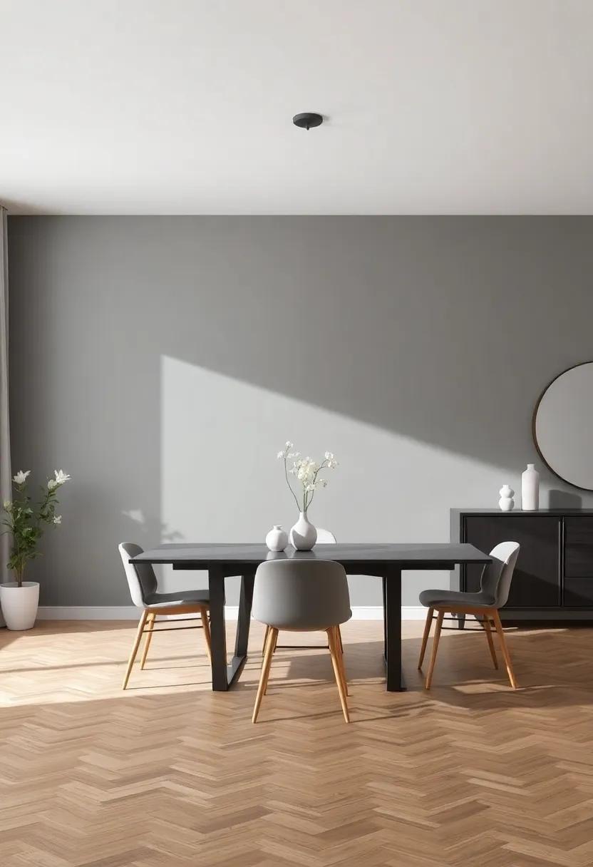
The allure of gray in dining room design lies in its remarkable adaptability, seamlessly blending with a variety of styles and aesthetics. Whether your space exudes modern minimalism or rustic charm, gray serves as the perfect backdrop. Its multitude of shades—from soft ash to deep charcoal—offers numerous options to create different atmospheres:
- Cool Tones: Light grays can evoke calmness, ideal for serene dining experiences.
- Warm Undertones: Greys with beige or taupe hints introduce warmth, making the space inviting.
- Accent Walls: A bold charcoal can serve as a dramatic focal point, especially when paired with vibrant decor.
In addition to its aesthetic versatility, gray enhances natural light, amplifying the overall spaciousness of the dining area. To further emphasize this effect, consider incorporating complementary colors and textures. Here’s a quick guide to pairing:
| Gray Shade | Complementary Color | Texture |
|---|---|---|
| Soft Gray | Pastel Pink | Silk Curtains |
| Medium Gray | Rich Navy | Wood Accents |
| Dark Gray | Bright Yellow | Metal Fixtures |
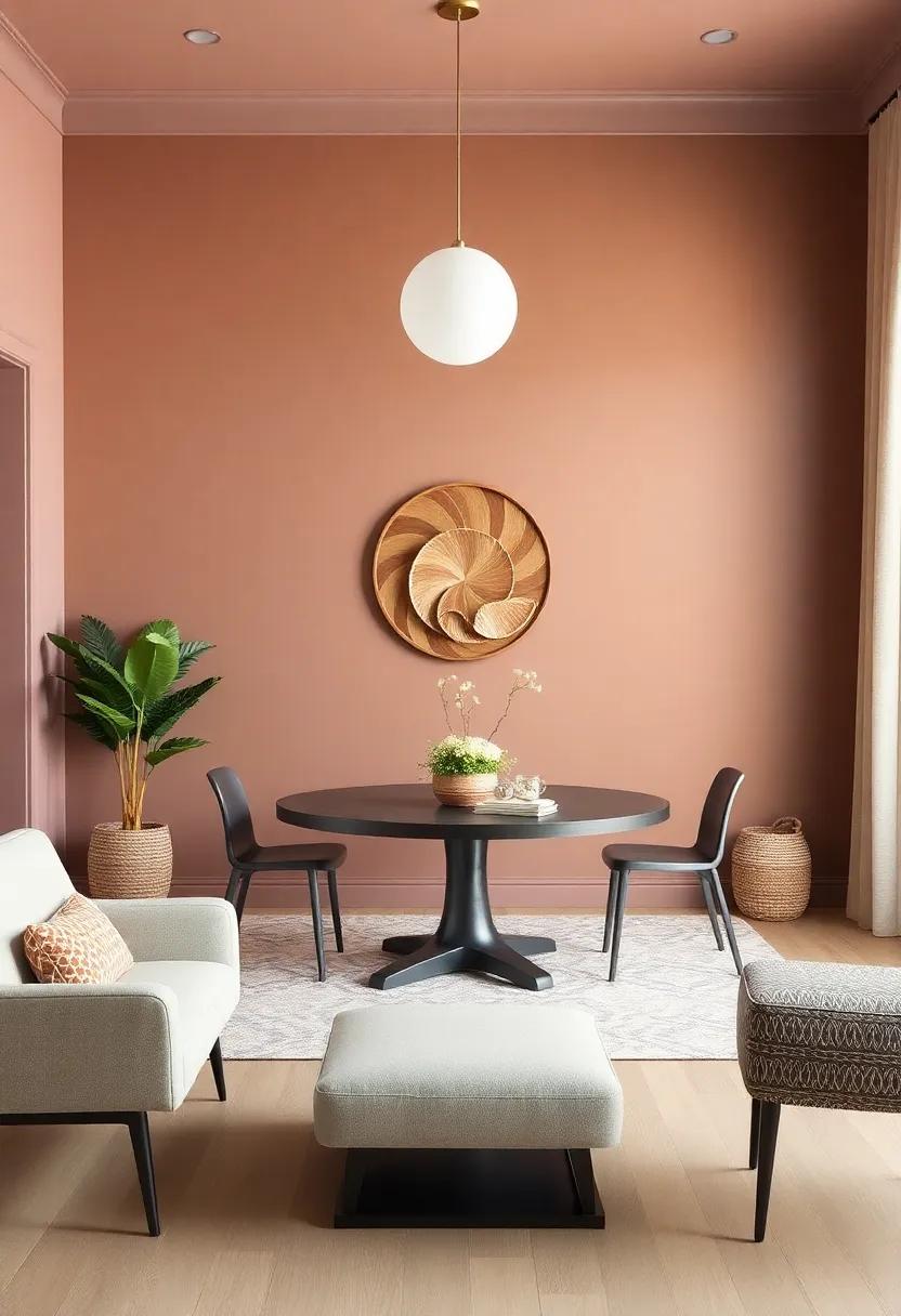
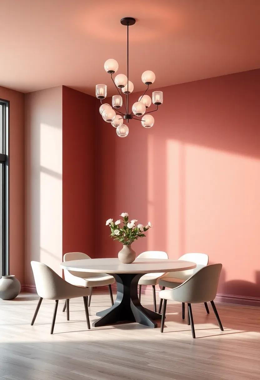
Rich Terracotta: Earthy Hues for a Warm and Inviting Ambiance
Embracing rich terracotta shades in your dining room can effortlessly create a cozy and inviting surroundings. This earthy hue resonates with warmth and can transform a bright, stark space into a haven of relaxation. Incorporating terracotta into your color scheme allows for an array of complementary elements, enhancing the overall aesthetic and fostering a warm, communal atmosphere. Consider the following design elements to maximize the effect of terracotta:
- Textures: Incorporate woven fabrics or natural wood finishes to emphasize the earthy vibe.
- Accessories: Use rustic pottery, warm-toned table linens, and decorative accents that echo the terracotta palette.
- Lighting: Soft, ambient lighting can enhance the depth of terracotta, making your dining space even more inviting.
To effectively incorporate terracotta into your dining room, balance is key.Pairing this warm hue with softer, neutral shades can help ground the space while allowing the terracotta to shine. Use the following color pairings to ensure a harmonious blend:
| Color pairing | Description |
|---|---|
| Terracotta & Cream | A classic combination that creates a light, airy feel while accentuating warmth. |
| Terracotta & Olive Green | Brings nature indoors,fostering a sense of tranquility and groundedness. |
| Terracotta & Dusty Blue | This duo offers a refreshing contrast, balancing warmth with cool tones. |
Soft Pastels: Adding a Touch of Whimsy to Your Dining Decor
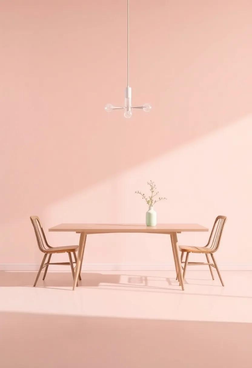
Soft pastels effortlessly breathe life into dining spaces, infusing them with a playful charm that invites warmth and conversation. Imagine your walls adorned with shades like blush pink, mint green, and baby blue, creating a serene backdrop that makes every meal feel special. These gentle hues work harmoniously with natural light, casting a soft glow that enhances the atmosphere and creates an inviting space for family gatherings or entertaining friends. With the right pastel palette, you can effortlessly blend sophistication with a touch of whimsy, leaving a lasting impression on your guests.
Pairing soft pastels with complementary decor choices is key to achieving a cohesive look. Consider incorporating elements such as:
- Mid-century modern furniture in light wood finishes to accentuate the pastel tones.
- Soft textiles,like linen tablecloths or pastel-hued curtains,to amplify comfort.
- Artwork or wall decorations featuring pastel shades to create focal points without overwhelming the space.
Additionally, utilizing a soft pastel accent wall can draw the eye and bring dimension to the room. This approach allows you to maintain a touch of elegance while creating an inviting atmosphere. Here’s a quick reference table to help you choose the perfect pastel shades for your dining decor:
| Color Shade | Emotion evoked | Perfect Pairing |
|---|---|---|
| Blush Pink | Warmth & Comfort | Gold Accents |
| Mint Green | Freshness & Calm | White Accessories |
| Light Lavender | Serenity & Peace | Grey Textures |
Dramatic Dark Shades: Exploring the Impact of Deep Colors in Dining Spaces
The allure of deep, dramatic shades in dining spaces is undeniable. Charcoal gray,for example,can lend an air of sophistication,creating an intimate setting perfect for family dinners or formal gatherings. These colors evoke feelings of warmth and comfort,drawing people together and encouraging conversation.Shades such as navy blue and forest green can transport diners to a serene and calming environment, enhancing the overall aesthetic of the room and making every meal feel like a special occasion. By carefully selecting darker hues, homeowners can achieve a balanced look that feels both cozy and refined.
Incorporating deep colors not only transforms the space visually but can also evoke strong emotional responses. Rich burgundy or deep plum might stimulate appetite, making them excellent choices for walls or accent features. To maximize the effect of these colors, consider pairing them with lighter furniture and decor to create contrast, while also enhancing the atmosphere. Below are some complementary colors that work beautifully with deep shades in dining rooms:
| Deep Shade | Complementary Color |
|---|---|
| Charcoal Gray | Soft White |
| Navy Blue | Coral or Peach |
| Forest Green | Creamy Beige |
| Rich Burgundy | Gold Accents |
Vibrant Yellows: Infusing Energy and Cheerfulness into Your Dining Room
Incorporating shades of yellow into your dining room can create an atmosphere of warmth and positivity that invites conversation and connection. Whether you opt for a soft buttercup or a bold canary, these vibrant hues energize the space and complement various decor styles. The right shade can serve as the perfect backdrop for lively gatherings, accentuating the joyful spirit that dining areas embody. To create an inviting environment, consider pairing yellows with natural textures and colors, such as wooden tables or greenery, to balance out the brightness while maintaining a refreshing vibe.
when selecting the ideal yellow, keep these tips in mind:
- Consider the lighting: Natural light can make yellows appear more vibrant, while artificial light may tone them down.
- Test samples: Paint swatches on the wall can help you visualize how the hue interacts with existing furniture and decor.
- Use complementary colors: Combine yellows with soft grays, white, or even deep navy to ground the brightness and create a harmonious palette.
Ultimately, a well-chosen yellow can transform your dining room into a cheerful haven, making each meal feel like a celebratory occasion.
Exquisite Jewel Tones: transforming Your Dining Room into a Luxurious Retreat
Infusing your dining room with jewel tones can create an atmosphere of opulence and comfort,transforming it into an inviting space for gatherings and celebrations. Consider painting your walls in rich colors such as emerald green, sapphire blue, or ruby red, which evoke feelings of warmth and luxury. these hues become a stunning backdrop for carefully selected decor, enhancing textures and materials in the room. Pair these deep shades with contrasting elements such as cream or soft grey furniture to allow the jewel tones to stand out, ensuring a balance between boldness and elegance.
To amplify the visual interest and depth in your dining space, think about incorporating metallic accents and natural elements. Reflective surfaces like gold or copper in light fixtures, tableware, or decorative accents can harmonize beautifully with jewel-toned walls. Additionally, introducing plants or wooden elements can provide an organic touch that tempers the richness of the colors. Below, you’ll find key color combinations and their potential effects in transforming your dining area:
| Color | Complementary Accents | Effect |
|---|---|---|
| Emerald Green | Gold, White | Refreshingly Bold |
| Sapphire Blue | Natural Wood, Silver | Calm and Serene |
| Ruby Red | Black, Ivory | Passionately Inviting |
textured Finishes: Enhancing Depth and character with Unique Paints
When it comes to creating an inviting atmosphere in your dining room, the choice of wall finishes can transform a simple space into an extraordinary experience. Textured paints, such as stucco, metallic, and venetian plaster, not only add a layer of depth but also serve as a visual feast for the eyes. these unique finishes can evoke various moods—from rustic warmth to modern elegance—delivering an immersive dining experience that captivates your guests. To amplify the effects, consider pairing these textures with strategically chosen lighting, creating a dance of shadows and highlights that enhances the character of the room.
Incorporating textured finishes allows for endless creativity. Here are some popular options to consider:
- Brushed Pearl: Adds a soft sheen, perfect for a subtle sophistication.
- Raw Silk: Offers a delicate,fabric-like appearance,enhancing the dining experience.
- Sandstone: Evokes a natural, earthy vibe, great for bringing an outdoor feel indoors.
For those looking to explore the interplay of colors and texture, consult the following table to inspire your paint selection:
| Texture | Color Pairing | Atmosphere |
|---|---|---|
| Metallic Finish | Rich Burgundy | Luxurious and Warm |
| Stucco | Muted Sage | Calming and Earthy |
| Venetian Plaster | Soft Cream | Elegant and Timeless |
Seasonal Color Inspiration: Adapting Your Dining Room Palette year-Round
Transforming your dining room palette to reflect the seasons is a delightful way to keep your space feeling fresh and inviting. As the leaves change color in autumn, consider warm earthy tones like rich terracotta or burnt sienna to create a cozy atmosphere. In contrast, springtime can breathe new life into your dining space with soft pastels like mint green or pale lavender, which evoke a sense of renewal. Summer is the perfect time to embrace the vibrancy of hues such as sunny yellows or turquoise that energize your gatherings, while winter calls for deeper shades like navy blue or forest green to cultivate warmth during the colder months.
When selecting your seasonal colors, think about incorporating accent pieces that can easily transition along with your wall hues. Consider adding elements like cushions, table linens, or artwork that resonate with your chosen palette. For instance, a table set against a creamy beige wall can come alive with rustic orange and golden yellow accents in fall, while light gray walls coudl seamlessly coordinate with vibrant coral and aqua in summer. To keep track of your seasonal transformations, refer to the following guide that pairs seasonal tones with corresponding accent colors:
| Season | Wall Color | Accent colors |
|---|---|---|
| Spring | Soft Pastels | Coral, Lemon Yellow |
| Summer | Bright Hues | Aqua, Fuchsia |
| Autumn | Warm Earth Tones | Pumpkin, Olive Green |
| Winter | Deep Shades | Cranberry, Charcoal |
Monochromatic Magic: The power of Shades and Tints in Dining Rooms
Color has an undeniable influence on ambiance and perception, especially in a setting designed for gathering and sharing meals. Monochromatic palettes dive deep into the subtlety of shades and tints, transforming a dining space into a serene nook that encourages connection and conversation. By focusing on a single color and its variations,one can create a harmonious environment that feels both cohesive and calming. Imagine a dining room enveloped in delicate ivory and cream, where warm taupe tones add depth, allowing for an understated elegance that invites guests to linger longer at the table.
Creating balance is key when utilizing a monochromatic scheme, and careful consideration of texture and material can enhance this effect dramatically. Pairing fabric choices like soft linen or sumptuous velvet with walls painted in complementary hues can elevate the aesthetic allure of your dining area. Don’t shy away from layering tones; a subtle approach to incorporating darker shades as accents—such as through furniture or decorative elements—can draw the eye and create visual interest. The right blend of shades can lead to a culinary experience that feels intimate and special, truly making the dining room a destination for memorable meals.
Accent Walls: Perfecting the Art of Focal Points in Dining Spaces
Incorporating an accent wall in your dining space can truly elevate the overall atmosphere of the room. This strategic design choice not only draws attention but also establishes a unique character that enhances the dining experience. Some popular options for creating a stunning focal point include:
- Bold Colors: Vibrant shades like deep blue or warm terracotta can energize the space.
- Textured Finishes: Consider using wood paneling or stone textures to add depth.
- Artwork Display: Choose a wall to showcase a gallery of curated artwork that reflects your personality.
- Wallpaper Patterns: A striking pattern can become the conversation starter during gatherings.
When selecting the perfect hue for your accent wall, consider how it complements the overall color scheme of the room. The right color can create an inviting setting for dining, while also harmonizing with surrounding décor.here’s a quick overview of color psychology in dining spaces:
| Color | Effect on Atmosphere |
|---|---|
| Red | Stimulates appetite and conversation. |
| Green | Promotes relaxation and balance. |
| Yellow | Encourages warmth and happiness. |
| Gray | Offers sophistication while allowing other colors to shine. |
Geometric Patterns: Adding Intrigue and Style Through Painted Designs
Transform your dining room into a breathtaking visual feast by incorporating geometric patterns through painted designs. These striking motifs can effortlessly blend style and intrigue, creating a stunning backdrop for your dining experiences. Consider applying geometric patterns on an accent wall using colors that harmonize with your chosen palette. Popular choices include the classic pairing of navy blue and white, or the bold contrast of charcoal gray with gold accents. By alternating sharp angles and soft curves, you can curate a playful yet sophisticated atmosphere that encourages conversation and connection.
To design your own unique geometric masterpiece, take inspiration from various patterns like chevrons, herringbones, or hexagons. Choose your paint finish wisely; a matte finish can add warmth while a glossy option introduces a modern touch. When painting, consider the scale of your designs—larger patterns work well in spacious rooms, while intricate designs may enhance smaller, more intimate spaces. Here are a few popular geometric styles to consider for your dining area:
- Chevron: A dynamic zigzag pattern that adds movement.
- Honeycomb: A modern, hexagonal design that offers depth.
- Stripes: Classic and versatile, stripes elongate the space.
- grid: A minimalist option that brings structure and balance.
Transitional Colors: Bridging Modern and Classic Styles in dining Decor
Blending modern and classic styles in dining decor hinges upon the careful selection of transitional colors that evoke warmth and sophistication.These hues serve as visual bridges, balancing the sleekness of contemporary elements with the timeless charm of traditional design. Soft grays and muted blues,for instance,can create harmony when paired with a rustic wooden dining table or a vintage chandelier. By opting for neutral tones that incorporate undertones of warmth, you can achieve a cozy atmosphere that invites conversation and connections. Consider adding splashes of color through accessories, like cushions or table runners, to further enrich the overall aesthetic.
To effectively utilize transitional colors, one can curate a palette that reflects both preferences and complements existing furnishings. A harmonious blend might include deep emerald greens juxtaposed with light taupes, or rich burgundy against crisp ivory. Together,these selections enhance the dining experience while paying homage to various styles. here’s a simple palette guide:
| Color | Feeling | Pairing Suggestions |
|---|---|---|
| Soft Gray | Calming | White accents, Natural wood |
| Muted Blue | Inviting | Gold fixtures, Cream fabrics |
| Deep emerald Green | Luxurious | Bronze touches, Light woods |
Cultural Influences: Exploring color Palettes Inspired by Global Dining Trends
When curating a color palette for your dining room, it’s fascinating to draw inspiration from the vibrant hues found in global culinary traditions. Italian trattorias, with their rich terracotta and olive green shades, evoke a warm, rustic charm perfect for family gatherings. Meanwhile, the bright spices of Indian cuisine inspire bold yellows and deep reds, creating an inviting and energetic atmosphere that encourages lively conversations. As people enjoy their meals, the colors serve to enhance the overall dining experience, blending cultural richness into the fabric of everyday life.
Exploring the elegant simplicity of Japanese aesthetics offers another unique angle; soft creams and delicate pastels create a serene environment, echoing the tranquility of a traditional tea ceremony. You can also embrace the lush Mediterranean vibes with seaside-inspired blues and sandy beiges that transport diners to sunny coasts. To visualize this cultural blend, consider the table below, which highlights a few prominent dining styles and their corresponding color inspirations:
| Dining Style | Color Palette |
|---|---|
| Italian Trattoria | Terracotta, Olive Green |
| Indian Cuisine | Bold Yellow, Deep Red |
| Japanese Aesthetics | Soft Creams, Pastels |
| Mediterranean Vibes | Seaside Blues, Sandy Beiges |
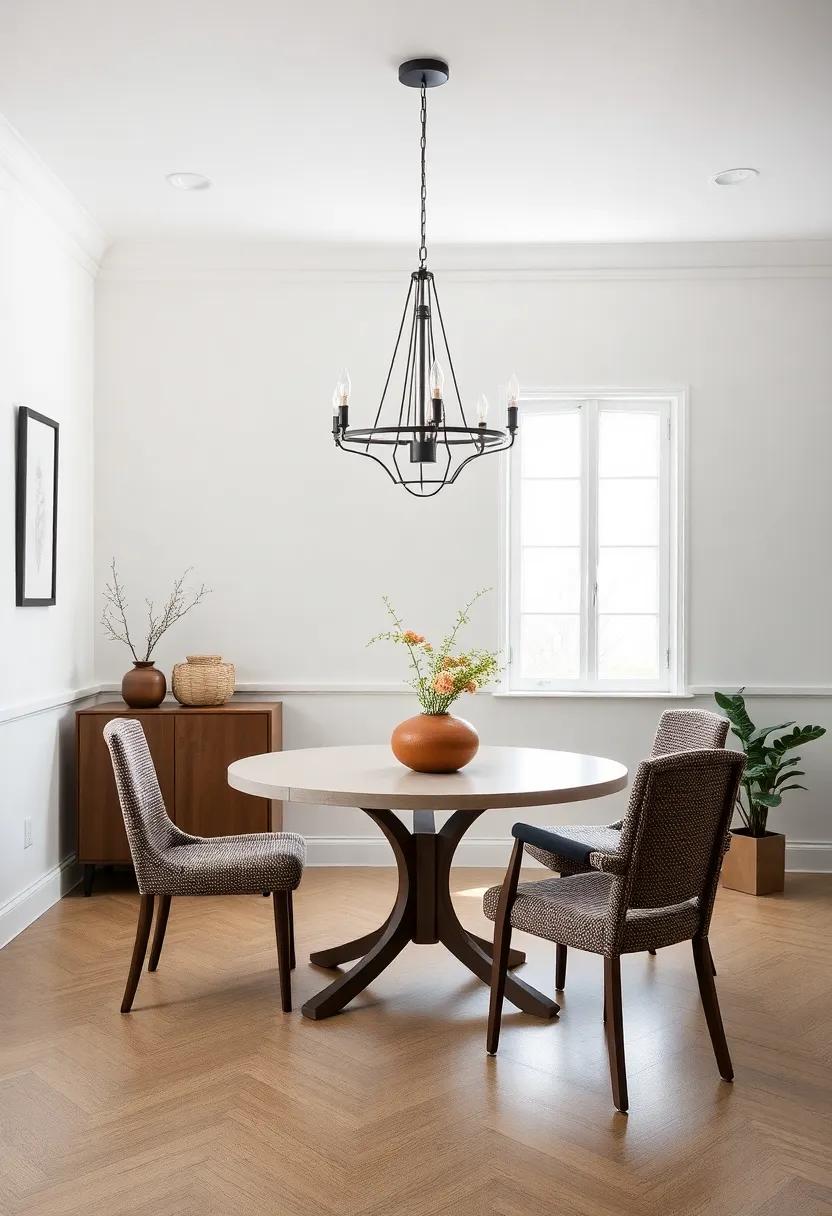
natural Light Optimization: Choosing Colors to Enhance Brightness and Space
To create a dining room that feels bright and spacious, choosing the right paint colors is essential. Light and airy hues can transform the atmosphere of the room, making it inviting for gatherings and meals alike. Consider colors such as soft whites, pale grays, and gentle pastels, which reflect natural light, amplifying the sense of space and serenity. When looking to introduce warmth, creamy tones offer a balance of brightness while keeping the room cozy—ideal for intimate dinner parties or family meals.
In addition to selecting the right shades, the overall finish of your wall paint plays a crucial role in light optimization. Matte finishes absorb light, which might not be ideal for smaller spaces, while glossy or satin finishes can reflect light beautifully, enhancing brightness. Here’s a simple overview of perfect color combinations to consider:
| Color | Mood | Best for |
|---|---|---|
| Soft White | Fresh | Maximizing Space |
| Pale Gray | Calming | Neutral Decor |
| Light Sage Green | Natural | Plant Accents |
| Peach | Warm | Cheerful Vibe |
Personalized touch: Infusing Your Unique Style into Dining Room Hues
Your dining room is more than just a space to eat; it’s where memories are made, laughter is shared, and conversations flow freely. To truly reflect your personality, consider choosing colors that resonate with your taste and lifestyle. Whether you gravitate towards bold and vibrant shades or prefer soft, muted tones, each hue can evoke different emotions and set a unique atmosphere. Some ideas to incorporate your style include:
- Accent walls: Choose a statement wall in a striking color to serve as the focal point.
- Textured Finishes: Add depth with techniques like sponging or rag rolling for a distinctive look.
- Artwork Integration: Coordinate your wall color with your artwork for a harmonious design.
Complementing your wall color with various decor elements can further elevate your dining space. Consider using furniture pieces and textiles that echo your chosen palette to create a seamless blend throughout the room. To guide your selection, here’s a quick reference on compatible colors:
| Main Color | Complementary Accent | Texture & Material Suggestions |
|---|---|---|
| Soft Blue | Warm Beige | Natural Wood, Linen |
| Rich Olive | Burnt Orange | Leather, Woven Fabrics |
| vibrant Coral | Deep Teal | Ceramic, Glass Accents |
Mood lighting and Color: The Relationship Between Shade and Ambiance in Dining Rooms
Choosing the right wall color can significantly influence the mood and ambiance of your dining room. Warm tones like rich reds, sunny yellows, and earthy oranges create an inviting atmosphere, encouraging lively conversations and enhancing culinary experiences. These shades tend to promote a sense of warmth and togetherness,making them perfect for family gatherings and intimate dinners. In contrast, cooler shades such as soft blues or calm greens can evoke tranquility and relaxation, ideal for a more laid-back dining experience. When you blend these colors with appropriate lighting—such as dimmable fixtures or warm-hued bulbs—you can fine-tune the environment to suit any occasion.
The interplay between light and color can also be strategically employed to highlight specific areas of your dining space. As a notable example, consider the impact of a well-placed pendant light over a bold accent wall. Here are some popular color choices and their corresponding effects:
| Wall Color | Ambiance Effect |
|---|---|
| Burnt Orange | Stimulates appetite and conversation |
| Soft Blue | Promotes calm and relaxation |
| Warm Yellow | Brightens the space and lifts spirits |
| Deep Green | Offers sophistication and connection to nature |
By thoughtfully selecting your paint palette and lighting fixtures,you can create a dining environment that not only reflects your personal style but also enhances the dining experience,making each meal memorable.
In Conclusion
As we wrap up our exploration of the art of color in the dining room, it becomes clear that the hues you choose can transform more than just your walls—they can shape the entire atmosphere of your dining experience. Whether you gravitate toward the soothing embrace of a muted sage or the bold statement of a deep navy, the right palette not only sets the stage for unforgettable meals but also invites moments of connection and warmth among family and friends.
as you embark on your own design journey, take the time to consider the mood you wish to create, the natural light in your space, and even the textures that will accompany your chosen colors. Remember that each shade tells a story, and with thoughtful selection, you can curate an environment that reflects your personal style while enhancing the joy of dining.
So, gather your swatches, envision your ideal ambiance, and let your creativity flow. With the perfect colors in your toolkit, your dining room won’t just be a place to eat; it will be a haven for shared experiences, laughter, and cherished memories. Here’s to palette perfection in your home!
As an Amazon Associate I earn from qualifying purchases.