

In a world bustling with noise and distraction,our bedrooms often serve as sanctuaries—a personal retreat where we seek solace and rejuvenation. The colors that envelop us in these sacred spaces play a important role in shaping our moods and fostering an atmosphere of tranquility. ”” invites you on an exploration of the enchanting spectrum of hues that can transform your sleeping quarters into a haven of peace. From soft blues that echo the sky’s embrace to gentle greens reminiscent of lush nature, each color possesses a unique ability to soothe the mind and nourish the spirit. Join us as we delve into the psychology of color and uncover the serene palette that awaits you in the quest for your ultimate bedroom sanctuary.
Rediscovering Tranquility Through Calming Color Palettes in Bedroom Design
In the pursuit of creating a tranquil haven, selecting the right colors is paramount. Subdued hues, such as soft blues, gentle greens, and muted earth tones, work wonders in promoting relaxation. These colors not only evoke feelings of peace but also enhance the overall harmony of your space. Consider integrating the following shades into your bedroom design to cultivate a serene atmosphere:
- Powder Blue: A delicate touch that mimics the calming affect of a clear sky.
- Lavender: Known for its soothing properties, it adds a subtle hint of elegance.
- Mint Green: Refreshing and revitalizing,bringing the essence of nature indoors.
- Beige or Taupe: Neutral ground that complements other colors, fostering balance.
To enhance the serene experience, consider the interplay of textures and materials. Soft linens in these chosen colors can transform the feel of the room,making it more inviting and comfortable. An effective way to visualize combinations is through a simple comparison of color pairings:
| Primary Color | Complementary Accent |
|---|---|
| Soft Blue | Warm White |
| Gentle Green | muted Gold |
| Lavender | Deep Plum |
| Beige | Dusty Rose |
The Psychology of Color: How Different Hues Influence Your Sleep Quality
The colors that surround us have a profound effect on our emotions and physiological responses.In the realm of sleep, certain hues can help foster an environment conducive to relaxation and restfulness. For instance, soft blues evoke a sense of calm, mimicking the tranquil hues of the sky. This shade can lower heart rates and reduce stress hormones, promoting deeper sleep. Similarly, gentle greens offer a refreshing vibe, reminiscent of nature. The presence of greenery in a bedroom can not only help to ease anxiety but also improve the overall sense of balance and harmony within the space.
On the other hand, colors like deep purples or soft beiges can also play an essential role in creating a soothing atmosphere. the richness of purple can instill a sense of luxury without being too stimulating, allowing the mind to unwind. Meanwhile, beige offers a neutral grounding that is both warm and inviting, making it an ideal backdrop for various accent pieces. to illustrate these calming colors, consider the following table of hues and their effects:
| Color | Psychological Effect |
|---|---|
| Soft Blue | Calming & Stress-Reducing |
| Gentle Green | Refreshing & Balancing |
| Deep Purple | Luxurious & Unwinding |
| Soft Beige | Warm & Inviting |
Soft Blues and Greens: Embracing Nature Indoors for a Relaxing Bedroom
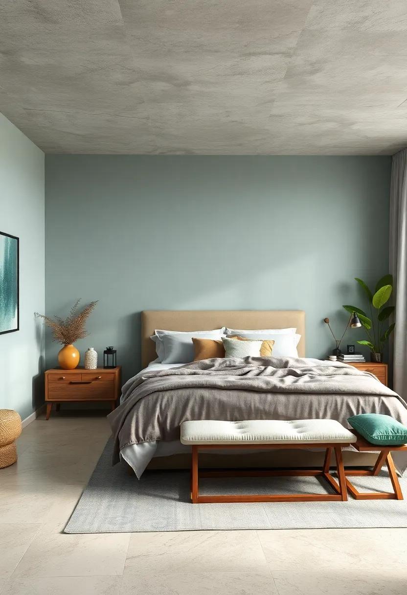
Transform your bedroom into a tranquil retreat by incorporating soft blues and greens, hues that mirror the serenity of nature. Soft blues evoke the calm of a clear sky or gentle waves,promoting relaxation and peaceful sleep. Pair these shades with muted greens, reminiscent of lush forests and delicate leaves, to instill a sense of balance. Together, these colors stimulate a soothing ambiance that can be complemented with natural materials, such as wooden furniture and woven textiles, enhancing the overall connection to the outside world.
Consider layering different textures to enrich the serene color palette. Add elements such as:
- Lightweight linens in soft aqua shades for your bedding
- Earthy, botanical prints on throw pillows or curtains
- Natural wood accents to ground the serene hues and provide warmth
By thoughtfully selecting accessories and furnishings, you will create a cohesive look that invites relaxation and reflects your personal style. The calming effects of these colors combined with nature-inspired elements are sure to elevate your bedroom into a serene sanctuary.
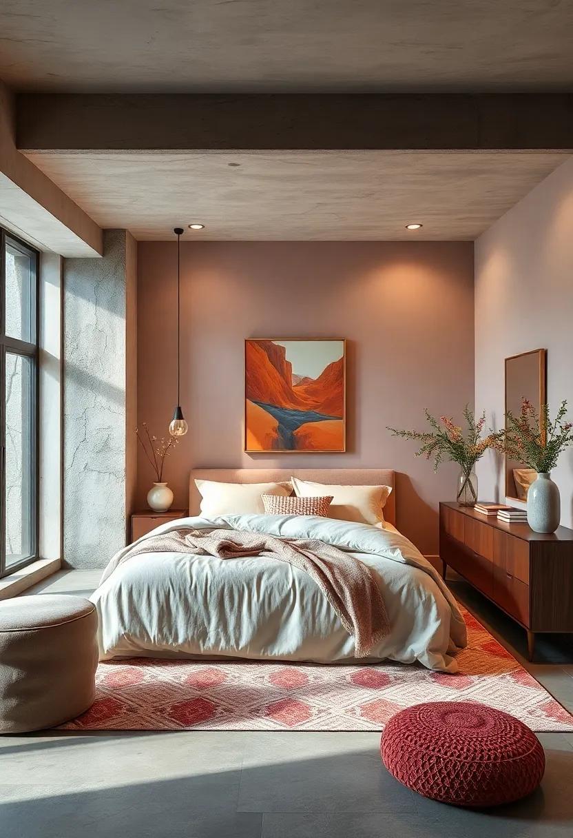
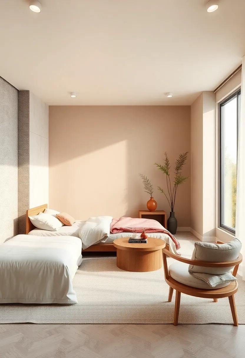
Muted Earth Tones: Grounding Your Space for Ultimate Serenity and Comfort
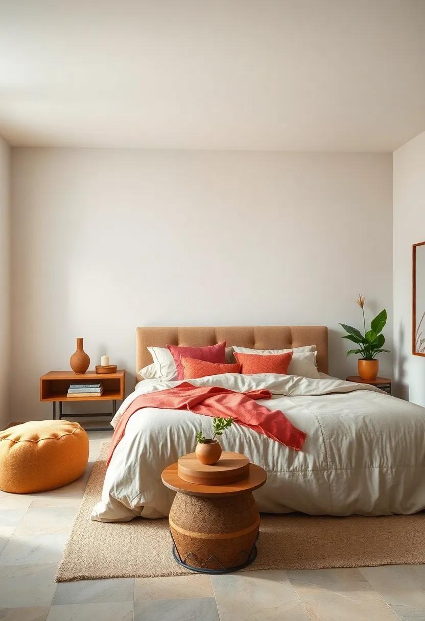
In the quest for a tranquil bedroom sanctuary, embracing muted earth tones can significantly elevate your sense of peace and comfort. These soft, natural shades evoke the tranquility of nature, creating a serene environment that encourages relaxation and restfulness. Warm taupes, gentle ochres, and cool sage greens bring a grounded quality to your space, harmonizing effortlessly with both modern and traditional decor.By selecting these soothing colors, you can create a scenic backdrop that fosters connection with the natural world, helping to ease the mind from daily stresses.
To enhance the calming effect, consider incorporating a mix of textures and materials that play off these earthy shades. Below is a selection of elements that beautifully complement a muted color palette:
| Material | Texture |
|---|---|
| Linen | Soft and breathable, ideal for curtains or bedding |
| Wood | brings warmth and an organic feel; great for furniture |
| Jute | Rough texture, perfect for rugs or baskets |
| Wool | Cozy and inviting; consider throws or cushions |
By integrating these elements, the overall aesthetic becomes not only visually appealing but also deeply comforting. This combination of muted tones and varied textures transforms your bedroom into a restful haven, where every element works in harmony to provide the ultimate retreat.
Whispering Whites: Infusing Lightness and Peace into Your Sanctuary
In the heart of any tranquil sanctuary, the presence of white can be transformative, evoking a sense of calm that envelops the space. Whispering whites bring forth an ethereal quality, creating a canvas that reflects light and radiates spaciousness. Whether it’s the soft glow of ivory or the crisp clarity of snow white, these shades serve as a soothing backdrop for relaxation and renewal. To enhance this serene atmosphere, consider incorporating natural textures and soft furnishings that complement the purity of white, adding depth and warmth to your retreat.
To achieve a balanced and peaceful aesthetic, pair whispering whites with delicate accents that highlight their beauty.Consider these elements:
- Subtle pastels for a gentle contrast
- Warm wood tones for grounding elements
- Pottery or ceramics for organic shapes
- Soft textiles like cotton and linen to invite comfort
Incorporating these elements can culminate in a cohesive design that promotes tranquility. Use a color palette table to visualize these combinations effectively:
| Shade | Effect |
|---|---|
| Ivory | Warmth and softness |
| Snow White | Clarity and spaciousness |
| Off-White | Cozy and inviting |
| Frosted White | Cool serenity |
By thoughtfully selecting shades and accompanying decor, you can transform your bedroom into a sanctuary that whispers serenity and invites peaceful moments.
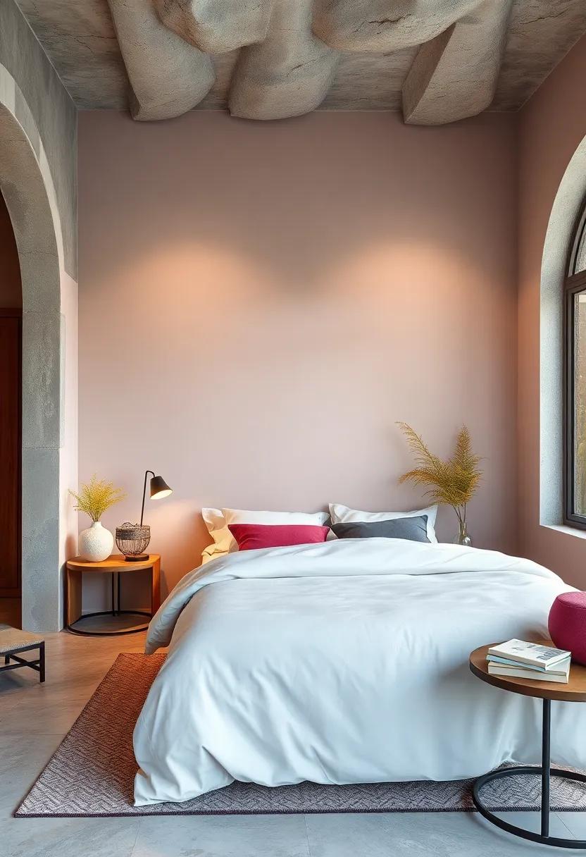
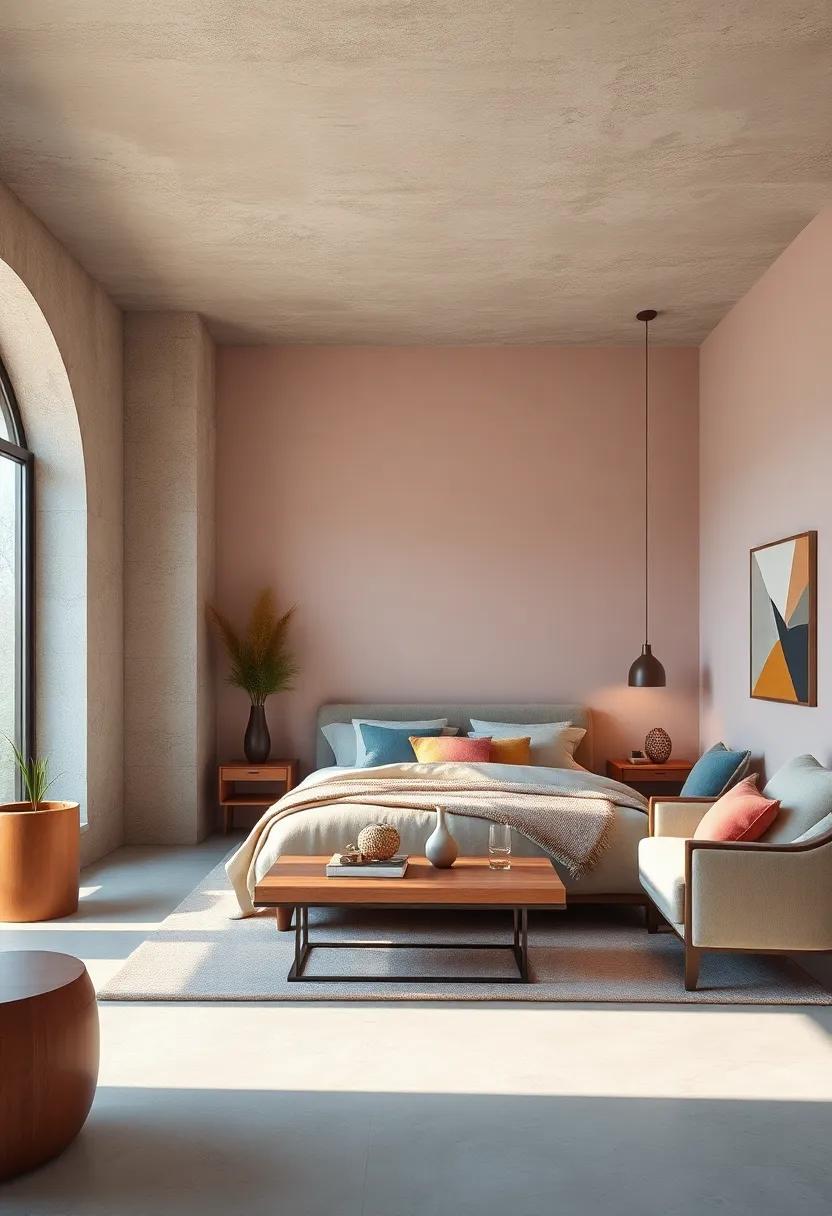
Enchanting Pastels: Gentle Hues That create a Soothing Ambiance
Pastel colors have an undeniable charm, effortlessly evoking feelings of tranquility and serenity.Incorporating shades such as soft lavender, mint green, and blush pink into your bedroom can transform the space into a calming retreat. These gentle hues harmonize beautifully with natural light, creating an inviting and peaceful atmosphere that welcomes relaxation after a long day. The subtlety of pastels allows them to act as a backdrop, harmonizing with bolder decor without overwhelming the senses. Choose from:
- Soft Lavender: Promotes restful sleep and relaxation.
- Mint Green: Invokes a sense of freshness and renewal.
- Blush Pink: Adds warmth and a touch of romance.
- Baby Blue: Encourages calmness, reminiscent of clear skies.
To further enhance the soothing ambiance, consider pairing these pastel colors with natural textures and soft fabrics. shades of pastel can achieve balance when used alongside neutral tones, creating a layered look that adds depth while staying true to a zen aesthetic. A well-organized palette not only reflects your personal style but also serves to promote mental clarity and peace. Here’s a simple overview of how various hues can work together:
| Pastel Color | Effect | Complementary Color |
|---|---|---|
| Soft Lavender | Calming, restful | White |
| Mint Green | Refreshing, airy | Beige |
| Blush Pink | Warm, inviting | Gray |
| Baby Blue | Peaceful, soothing | Soft Yellow |
Layering Shades: Techniques for Combining Colors in Your Bedroom Retreat
Combining colors in your bedroom retreat can transform the space into a tranquil haven. One of the most effective techniques is to utilize a monochromatic palette, which focuses on varying shades of a single color. This approach fosters a sense of harmony and serenity, allowing you to play with textures and patterns without overwhelming the senses. As a notable example, pairing soft pastel blues with deeper navy accents can create a calming effect while still adding depth. Accent walls painted in a slightly darker hue can provide a focal point without clashing with the overall scheme.
Another method to explore is the complementary color strategy. Selecting colors that sit opposite each other on the color wheel can energize your space while maintaining a soothing ambiance. Shades like soft greens paired with muted reds or taupes can evoke feelings of balance and comfort. Utilizing decorative elements such as cushions, throws, and art can seamlessly introduce these colors into your retreat. Consider using a color-blocking technique for these accents, where bold color patches are strategically placed against neutral backgrounds to create a visual interest that remains serene. Here are some helpful color combinations:
| Base Color | Complementary Accent |
|---|---|
| Soft Blue | Warm taupe |
| Pale Green | Dusty Rose |
| Lavender | Soft Yellow |
| Muted Gray | Chic Coral |
Textured Tranquility: Using Fabrics and Patterns to Enhance Color Impact
Enhancing the visual appeal of your bedroom sanctuary can be achieved by strategically incorporating textures and patterns. soft fabrics, such as cotton or linen, can add a gentle touch to your space, while patterned accessories can inject personality and depth. Consider using layered textiles, such as:
- Throw pillows: Mix and match various textures to create a cozy atmosphere.
- Blankets: Opt for chunky knits or soft fleece to provide warmth and comfort.
- Curtains: Light, sheer materials can diffuse natural light, enhancing a serene ambiance.
To further emphasize the calming colors within your space, choose patterns that echo the tranquility you seek. Subtle designs inspired by nature, like leaves or waves, can resonate with a soothing vibe. When planning your decor, consider how the following fabrics can complement your chosen color palette:
| Fabric Type | Texture | Pattern ideas |
|---|---|---|
| Cotton | Soft and breathable | Floral or geometric |
| Velvet | lush and rich | Abstract or damask |
| Linen | Textured yet light | Striped or plaid |
Mood Lighting: the Role of Light in Enhancing Calming Colors
Lighting is an unsung hero in the quest for tranquility within your bedroom. by choosing the right types of light, you can significantly enhance the soft, calming hues that define your sanctuary. Consider the following options to create an atmosphere of serenity:
- Dimmable Lamps: These allow you to adjust the brightness based on the time of day and mood.
- Warm LED Bulbs: Emitting a softer glow, they complement cool blues and soft greens beautifully.
- Fairy Lights: Adding a whimsical touch, they can create a starry night feel, evoking peace and calm.
Incorporating layered lighting strategies can also help you achieve the perfect ambiance. By integrating key elements, you can harmonize your space while enhancing the calming colors:
| Lighting Type | Effect on Color |
|---|---|
| Ambient Lighting | Provides overall illumination, making calming colors feel more spacious. |
| Task Lighting | Highlights specific colors and areas, perfect for reading or meditation. |
| Accent Lighting | Draws attention to calming decor, enhancing visual interest without overwhelming the senses. |
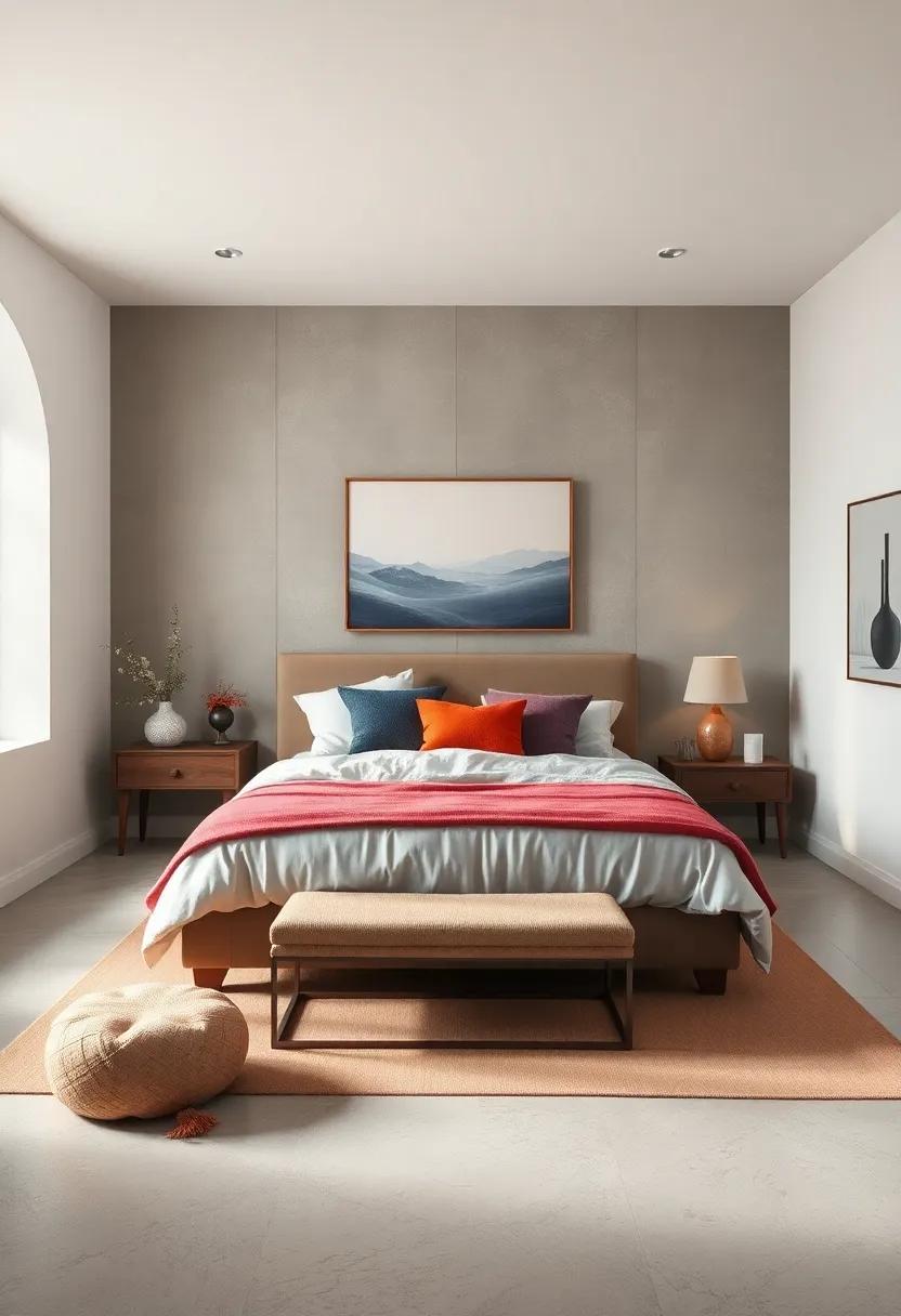
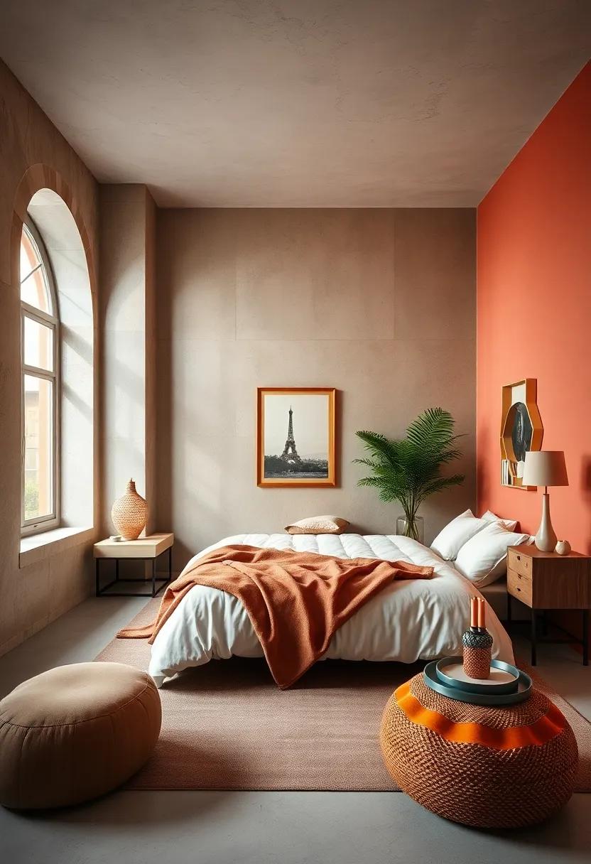
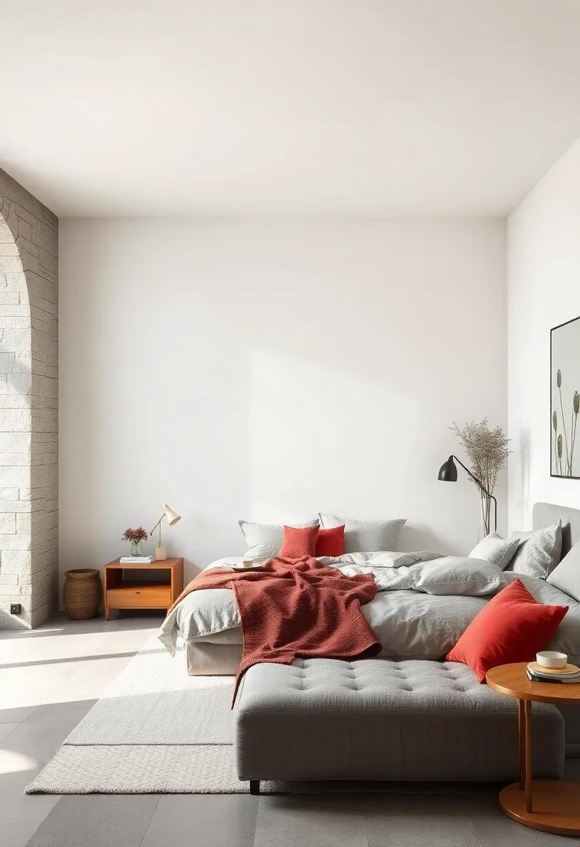
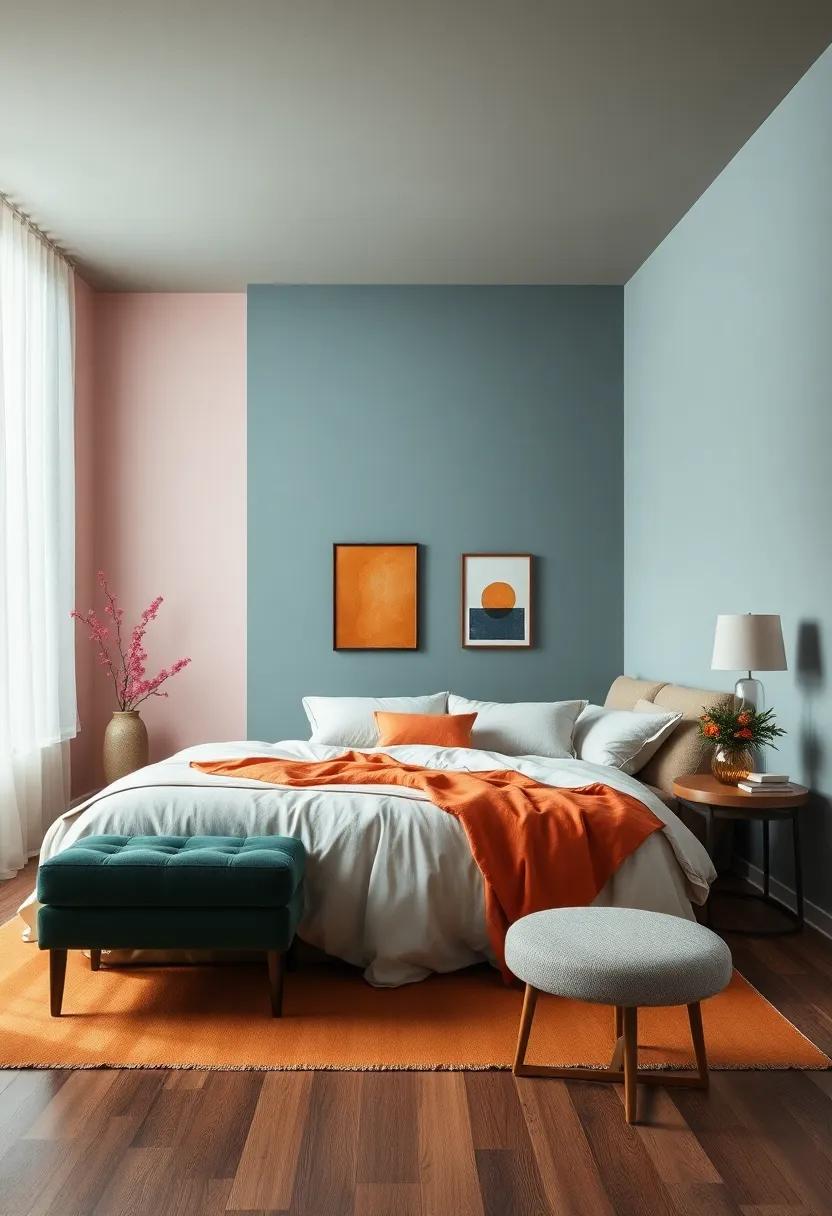
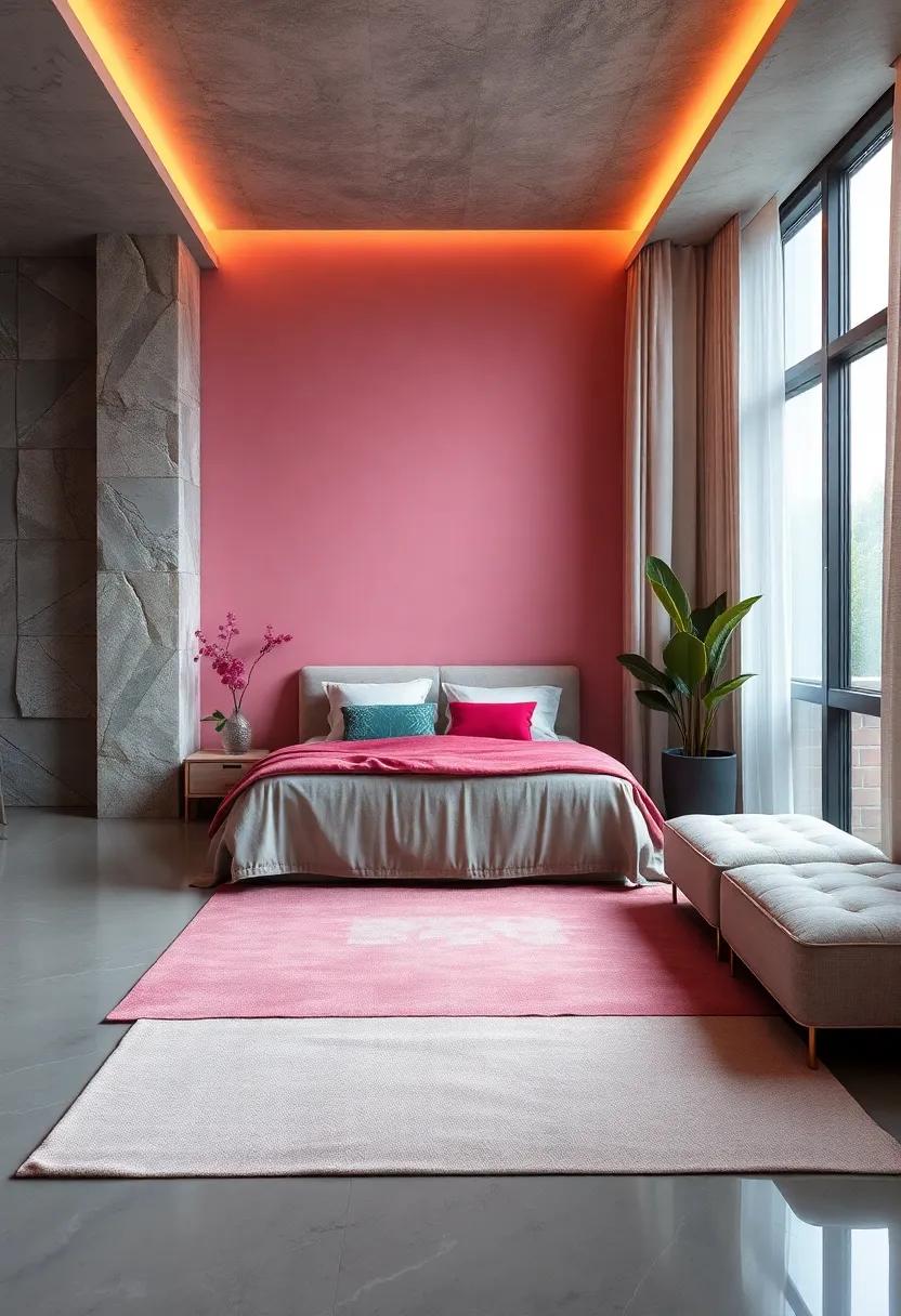
Color Blocking: Bold Yet Serene Combinations for a Unique Bedroom Look
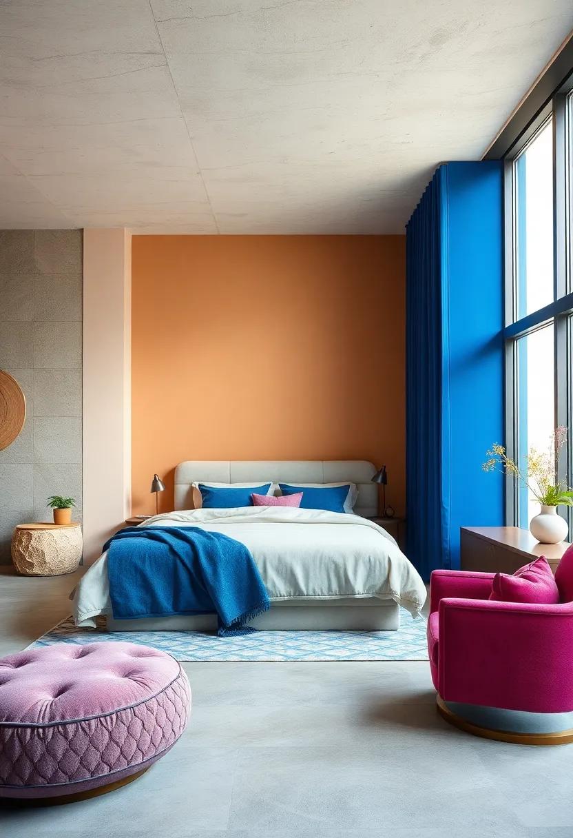
Color blocking in the bedroom offers a refreshing take on interior design by merging bold hues and calming tones to create a serene yet invigorating atmosphere. Imagine a backdrop of soft sage paired with pops of deep teal; this combination invites tranquility while still maintaining visual interest. The key is to strike a harmonious balance between vibrant and muted shades, allowing each color to complement and enhance one another. A well-thought-out mix provides a layered aesthetic that fosters relaxation, making your bedroom a perfect retreat.
To achieve an impactful color-blocked design, consider using large blocks of color on walls, bedding, or furnishings. Here are some effective combinations to inspire your palette:
- Soft blush with navy blue
- Muted lavender with charcoal gray
- Creamy beige with emerald green
- Pale aqua with warm terracotta
Each of these pairings evokes a sense of calm, while still making a statement. By incorporating texture through fabrics or art pieces, you can further enhance the color blocking effect, creating a visually rich and inviting sanctuary.
The Harmonious Blend of warm and Cool Colors: Finding Balance in Your Space
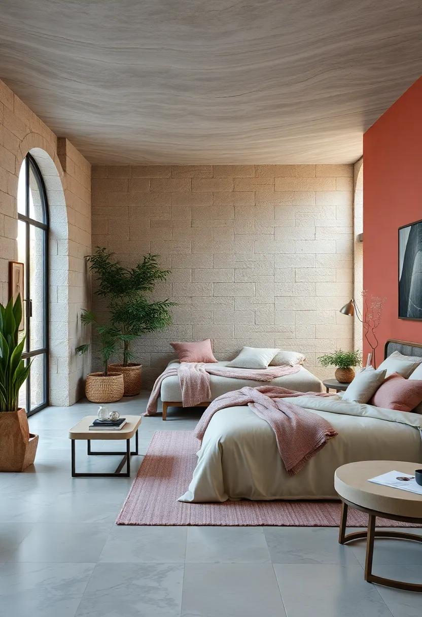
Creating a balanced environment in your bedroom is essential for enhancing relaxation and fostering a sense of peace. By thoughtfully combining warm and cool colors,you can achieve a harmonious ambiance that promotes tranquility. warm colors like soft terracotta, gentle peach, and creamy ivory bring a touch of comfort and coziness to your sanctuary, encouraging feelings of warmth and safety. In contrast, cool colors such as soothing blues, serene greens, and soft lavenders introduce a calming factor that can help reduce stress and tension.
To effectively blend these palettes, consider incorporating the following elements:
- Accent Walls: Paint one wall in a warm hue while keeping the others cool to create visual interest.
- Textiles: use bed linens and throws in varying shades to highlight both warm and cool tones.
- Artwork: Select art pieces that incorporate both color families to tie the room together.
- Accessories: Mix home decor items like cushions, rugs, and curtains that showcase a blend of warm and cool shades.
| Warm Colors | Cool Colors |
|---|---|
| Soft Terracotta | Calm Blue |
| Creamy Ivory | Peaceful Green |
| Muted Coral | Gentle Lavender |
Nature-Inspired Shades: Bringing the outdoors In for a Calming Effect
Transform your bedroom into a serene retreat with shades inspired by the natural world. Incorporating colors that reflect the beauty of the outdoors can create a soothing atmosphere, allowing you to unwind and recharge. Consider these nature-inspired hues that evoke tranquility:
- Soft Greens: Reminiscent of lush foliage, soft greens can lower stress levels and promote a sense of calm.
- Muted Blues: Reflecting the sky and water, these shades help to instill a peaceful ambiance.
- Earthy Tans: Channeling the warmth of soil, earthy tones provide a grounding sensation perfect for relaxation.
- Delicate Grays: Similar to the peaceful gaze of a cloudy sky, soft grays create a gentle and serene backdrop.
Utilizing these colors can enhance your room’s overall vibe, and when combined harmoniously, they can produce a space that feels both refreshing and calming. Below is a simple color palette table inspired by the elements:
| Color | Element | Emotional Effect |
|---|---|---|
| Soft Green | Earth | Vitality & Renewal |
| Muted Blue | Water | peace & Clarity |
| Earthy Tan | Earth | Stability & Comfort |
| Delicate Gray | Air | Calm & Serenity |
Meditative Monochrome: The Power of Subtle Shades in Your Bedroom Design
In the quest for a tranquil bedroom, the use of subtle shades can be transformative. By incorporating a palette that leans on soft hues,you can create a space that fosters relaxation and mindfulness. Shades such as whispering whites, gentle grays, and muted blues serve as the perfect canvas for a serene atmosphere. These colors not only promote calmness but also open up the space, making it feel larger and more inviting. By layering textures and materials in these shades,you can achieve a harmonious look that soothes the senses.
When considering the integration of subtle colors in your bedroom, think about how each shade can influence your mood. Some of the most calming colors include:
- Pale Blue: Known for its tranquil effect, it mimics the sky and sea.
- Soft Gray: Brings sophistication while staying neutral, promoting a cozy ambiance.
- Warm Beige: Adds a touch of warmth, providing comfort without overwhelming the senses.
For a more tailored approach,you can reference the calming color combinations in the table below:
| Color | Effect |
|---|---|
| Pale Green | Promotes rejuvenation and balance. |
| Dusty Rose | Evokes nostalgia and warmth, ideal for a romantic feel. |
| Ivory | Enhances brightness, offering freshness without starkness. |
Creating an Oasis: How to Use Color to Craft Your Perfect relaxation Space
To transform your bedroom into a rejuvenating sanctuary, start by exploring a palette of soothing hues that promote relaxation and tranquility. Consider incorporating soft blues reminiscent of a clear sky, which can create a sense of serenity, or gentle greens that evoke the calming essence of nature. Alternatively,muted lavenders offer a sophisticated touch while encouraging a peaceful atmosphere. Choose your base color and complement it with accents to add depth and personal flair. Using a harmonious blend of colors can enhance the overall ambiance, ensuring your space feels cohesive and inviting.
When selecting colors, think about the psychological effects they can impart. Warm neutrals like taupe and beige can create a soothing backdrop, while the coolness of pale gray can act as a tranquil canvas for brighter accents. Below is a simple table highlighting some of the most effective calming colors and their corresponding benefits:
| Color | Benefits |
|---|---|
| Soft Blue | Promotes relaxation and lowers stress |
| Gentle Green | Enhances mood and fosters calmness |
| Pale Lavender | Induces tranquility and peace |
| Warm Taupe | Creates a cozy and inviting atmosphere |
| Pale Gray | Encourages focus while maintaining harmony |
Personal Sanctuary: Choosing Colors that Reflect Your Unique Peaceful Vibe
Creating your personal sanctuary requires a thoughtful selection of colors that resonate with your inner peace. Soft blues evoke the calmness of the ocean, promoting relaxation and serenity. Meanwhile, gentle greens mirror nature’s tranquility, bringing the outdoors inside and fostering a sense of harmony. Other noteworthy choices might include lavender, which has soothing properties, or light grays, offering a neutral backdrop that allows other decorative elements to shine. consider how these colors make you feel, as they should reflect your unique vibe while ensuring a restful atmosphere.
As you embark on this decorative journey, think about incorporating various shades and textures to enhance the overall ambiance. Below are some color combinations to consider for your bedroom sanctuary:
| Color | emotion | Use In |
| Soft Blue | Calm | Walls, Bedding |
| Gentle green | Rejuvenation | Accent Walls, Décor |
| Lavender | Soothing | Pillows, Throws |
| Light Gray | Balance | furniture, Curtains |
Experiment with various combinations of these shades through paint, textiles, and accessories to curate a personalized atmosphere that speaks to your peaceful essence. Each hue can harmonize beautifully, transforming your bedroom into a serene retreat that invites rest and rejuvenation.
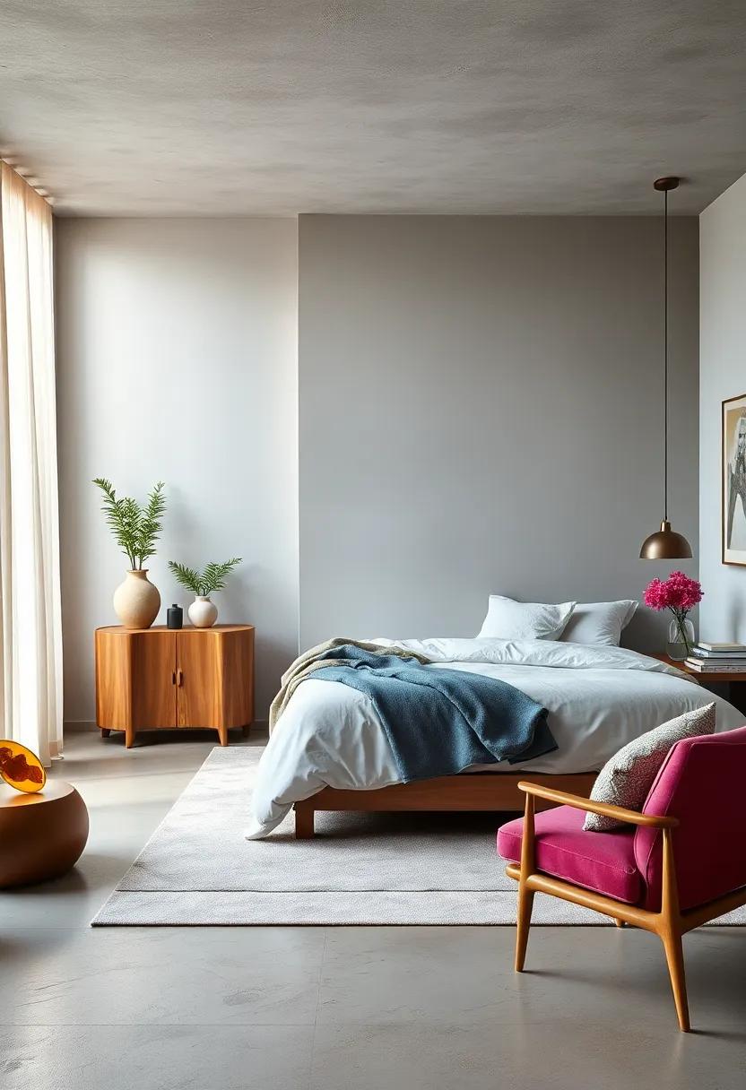
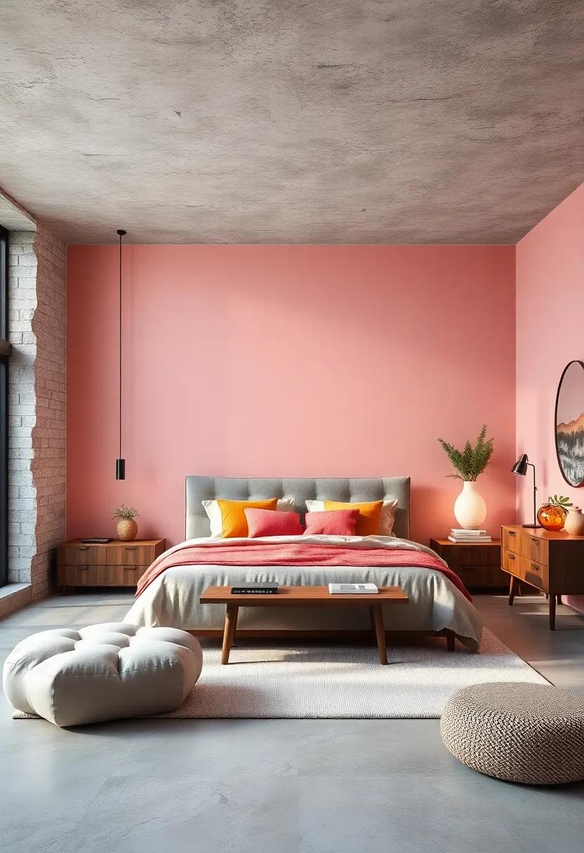
Art of Accents: Incorporating Color Pops for Mindful Spaces
To elevate the tranquility of your bedroom sanctuary, consider infusing subtle color pops that harmonize with calming shades. Integrating bold hues doesn’t have to disrupt the serene ambiance; rather, they can serve as invigorating focal points that uplift and energize. Here are some suggestions to thoughtfully introduce accents into your space:
- Accent Pillows: Choose vibrant yellows or muted corals to break the monotony of neutral bedding.
- Artwork: Incorporate pieces featuring geometric patterns with hints of teal or mustard to spark visual interest without overwhelming the senses.
- Throw Blankets: A rich emerald or sapphire throw draped over a chair can add warmth and personality.
For an effective palette, consider balancing your main color scheme with complementary tones that evoke feelings of peace. Below is a simple table to explore a few choose color combinations that could enhance the tranquil environment while still showcasing those lively pops:
| Base Color | Accent Color | Emotion evoked |
|---|---|---|
| soft Blue | Coral | freshness |
| Pale Gray | Deep Yellow | Optimism |
| Pastel Green | Lavender | Serenity |
Reflective Surfaces: Using Color and Light to Expand Bedroom Aesthetics
incorporating reflective surfaces into your bedroom design not only enhances the sense of space but also acts as a canvas for color and light to playfully dance around your sanctuary. consider mirrors, glossy finishes, and glass accents that can magnify the calming hues you choose. Strategically placing a large mirror opposite a window can double the natural light, amplifying soothing colors like soft blues, seashell pinks, or muted greens.As the sun shifts throughout the day, watch how the reflections create a dynamic living palette that inspires serenity.
To optimize the effects of these reflective surfaces, think about the colors that resonate with tranquility. Here are some color combinations to consider:
- Soft Lavender paired with a glossy white trim
- Pale Sage Green complemented by shimmering gold accents
- Dusty Rose alongside mirrored furniture to introduce warmth
When assessing the light conditions in your bedroom, it’s key to analyse how different times of day can alter the perception of color. A simple table can definately help track the impact of natural and artificial light on your chosen palette:
| Time of Day | Light Quality | Color Perception |
|---|---|---|
| Morning | Soft and Warm | Colors appear muted and relaxing. |
| Noon | Luminous and Direct | Colors are vibrant and energizing. |
| Evening | Golden and Gentle | Colors take on a warm, cozy feel. |
Color and Wellness: Understanding the Health Benefits of Your Bedroom palette
Color plays a pivotal role in shaping our emotions and overall well-being, especially in intimate spaces like the bedroom.Soft hues can have a profound impact on our mood,promoting a sense of calm and relaxation. For instance, shades of blue are often associated with tranquility, mimicking the expansive sky and serene waters, while soft greens evoke the refreshing essence of nature. Incorporating these colors can definitely help reduce stress levels and improve sleep quality, making your bedroom a true sanctuary for rest.
In addition to blue and green, other calming colors can enrich your sleeping environment. Consider the following options:
- Pale Lavender: A subtle blend that instills peace without overwhelming the senses.
- Warm Beige: A neutral tone that creates a cozy atmosphere while retaining an airy feel.
- Dusty Rose: Adds a gentle touch of warmth and comfort,balancing tranquility with romance.
To help you visualize the impact of these colors, here’s a simple comparison table:
| Color | Benefits |
|---|---|
| Blue | Promotes relaxation and lowers heart rate |
| Green | Enhances balance and harmony, alleviating anxiety |
| Pale Lavender | Soothes the mind and encourages restful sleep |
| Warm Beige | Creates a cozy, inviting space for relaxation |
| dusty Rose | Adds warmth and comfort, fostering emotional well-being |
inspirational Imagery: Choosing Artwork to Complement calming Colors
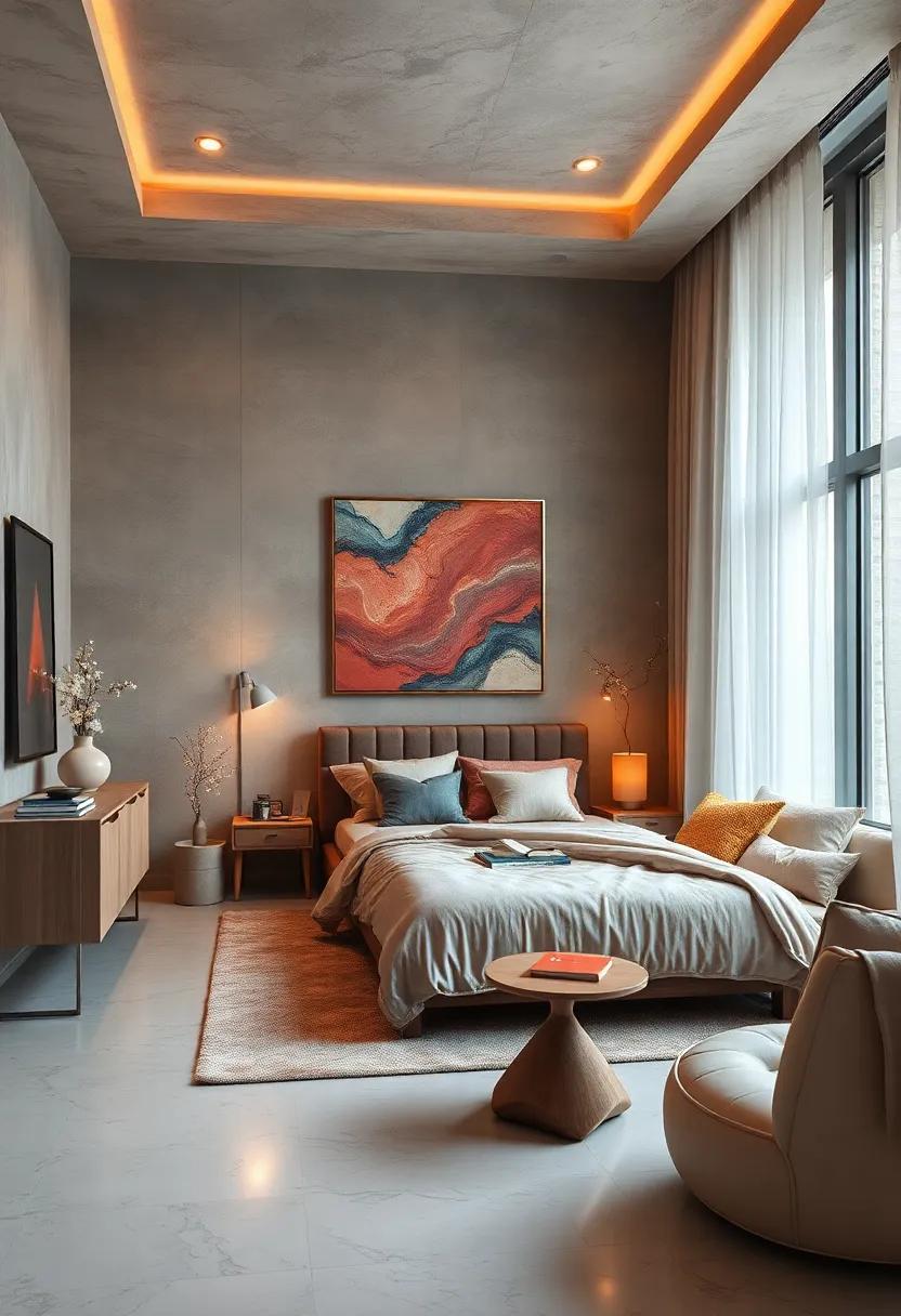
To create a true sanctuary in your bedroom,selecting the right artwork is key to enhancing the soothing effects of calming colors. Art has the unique ability to evoke emotions and set the tone of a space, making it crucial to choose pieces that resonate with tranquility. When considering artwork, look for imagery that reflects nature or serene landscapes, as these can create a calming environment. Choose pieces featuring soft lines, gentle curves, and soothing themes that align with your palette, such as:
- Abstract designs in soft blues and greens
- Photography of peaceful scenes, like lakes or sunsets
- Botanical illustrations in muted tones
- Minimalist art with simple compositions
When placing artwork in your sanctuary, consider its scale and placement for maximum impact. A large piece above the bed can serve as a focal point, drawing the eye and amplifying the color scheme, while a collection of smaller pieces can create an intimate gallery wall that invites tranquility. Ensure that the frames and matting also complement the calming hues of your room. Here are a few suggestions for cohesive combinations:
| Color Scheme | Artwork Theme |
|---|---|
| Soft Neutrals | Monochrome abstract art |
| Cool Blues | Ocean photography |
| Earthy Greens | Leafy botanical prints |
| Warm Creams | Sunset landscapes |
Color Transitions: Flowing from bedroom to relaxation Areas with Style
To create a harmonious flow between your bedroom and relaxation areas, consider employing a palette of calming colors that transition gracefully from one space to another. Soft hues like powder blue, sage green, and soft lavender can serve as the foundation for this tranquil aesthetic. These shades not only foster a serene atmosphere but also allow your eye to wander effortlessly, creating a sense of unity throughout your home.Emphasizing smooth gradients between these colors in both your bedding and decor can enhance the inviting feel, encouraging a seamless experience as you move from the restful environment of your bedroom to the comforting embrace of your relaxation nook.
To further accentuate the connection between these areas, consider layering in accents that reflect your chosen color scheme. utilizing decorative elements like cushions, throws, and artwork can infuse personality while maintaining overall balance. Opt for accessories that feature textures and patterns similar to your base color palette. Here are a few suggestions for your decor:
| Color | Accent Ideas |
|---|---|
| Powder Blue | Throw Pillows, Wall Art, Area Rugs |
| Sage Green | Candles, Plant Pots, bed Linens |
| Soft Lavender | Wall Hangings, Curtains, Decorative Trays |
Incorporating these elements will ensure that each space feels interconnected while promoting a soothing ambiance throughout your sanctuary. By thoughtfully selecting colors and accessories that resonate with one another, you can create an environment where relaxation and peace flourish effortlessly.
Creating a Zen Vibe: Minimalist Approaches to Calming Color Enhancements
Creating a serene atmosphere in your bedroom starts with the colors you choose. Soft, muted tones can evoke a sense of tranquility and promote relaxation after a long day. Consider incorporating calming hues such as:
- Soft blues: Known for their ability to reduce stress and anxiety, gentle blue shades mimic the sky’s serene expanse.
- Pale Greens: These earthy tones bring a connection to nature, helping to foster a sense of peace and rejuvenation.
- Warm Grays: These versatile shades achieve a cozy, inviting atmosphere without overwhelming the senses.
- Lavender: A soft purplish tone that encourages relaxation, making it perfect for a calming bedroom retreat.
when integrating these colors into your sanctuary, think about the balance between minimalism and warmth. Choose furniture and decor that enhance rather than detract from your space’s calming vibe. Simple, understated pieces create an open environment, allowing your chosen colors to stand out. For inspiration, consider the following table, which outlines ideal accent elements:
| Element | Suggested color | Purpose |
|---|---|---|
| Wall Color | Soft Blue | Promotes tranquility |
| Bedding | Pale Green | enhances relaxation |
| Accent Pillows | Warm Gray | Adds coziness |
| Rug | Lavender | Creates a calming focal point |
Concluding Remarks
As we journey through the vibrant spectrum of colors, it’s evident that the hues we choose for our sanctuaries can profoundly influence our state of mind. By embracing calming colors like soft blues, gentle greens, and warm neutrals, we can transform our bedrooms into serene retreats where relaxation reigns. Whether you’re revamping a space or simply looking to refresh your environment, remember that the art of color selection is not just about aesthetics; it’s about creating an atmosphere that nurtures peace and tranquility.
As you embark on this colorful exploration, allow your intuition and personal tastes to guide you. After all,your bedroom is more than just a place to rest—it’s your personal sanctuary where serenity flourishes. So take a step back, breathe deeply, and let these calming colors wash over you, crafting a haven where you can unwind, recharge, and dream.
As an Amazon Associate I earn from qualifying purchases.