

When it comes to creating a sanctuary in your home, the bedroom often serves as the ultimate retreat—a personal haven where comfort and tranquility reign supreme. The right paint colors can transform this intimate space, setting the mood for restful nights and peaceful mornings. As you embark on the journey of reimagining your sleeping quarters, consider the profound impact that color can have on your overall well-being. From soft, soothing pastels to rich, enveloping hues, the palette you choose can evoke feelings of calm, security, and warmth. In this article, we’ll explore the best bedroom paint colors that not only enhance your space but also cultivate a cozy atmosphere, making it the perfect refuge from the outside world. Whether you’re aiming for a serene ambiance or a bold statement, your ideal bedroom awaits just a brushstroke away.
transformative Hues: Exploring the Emotional Impact of Color in Your Bedroom
Color has a profound effect on our emotions and overall well-being, especially in spaces where we seek comfort and relaxation. In your bedroom, hues can evoke different feelings and set the tone for restful nights and rejuvenating mornings. for a serene atmosphere, consider soft blues and greens, which are often associated with tranquility and nature. These shades can reduce stress and promote a sense of calm, making them perfect for a cozy retreat. Shades like lavender also work wonders, providing a gentle balance between soothing and stimulating, perfect for winding down after a long day.
Conversely, if you’re aiming for a more energetic vibe, yellows and warm neutrals can infuse your space with warmth and cheerfulness. These colors are great for those who work or study late into the night,as they keep the habitat lively yet inviting. here’s a quick comparison of colors and their associated feelings to help you choose wisely:
| Color | Emotional Impact |
|---|---|
| Soft Blue | Calm and focus |
| Lavender | Soothing with a hint of creativity |
| Warm Yellow | Cheerful and uplifting |
| Earthy Beige | Grounding and cozy |
| Deep Green | Restorative and refreshing |
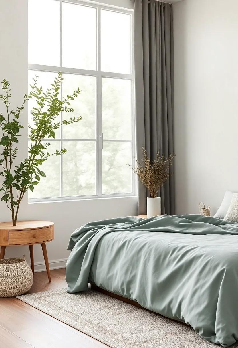
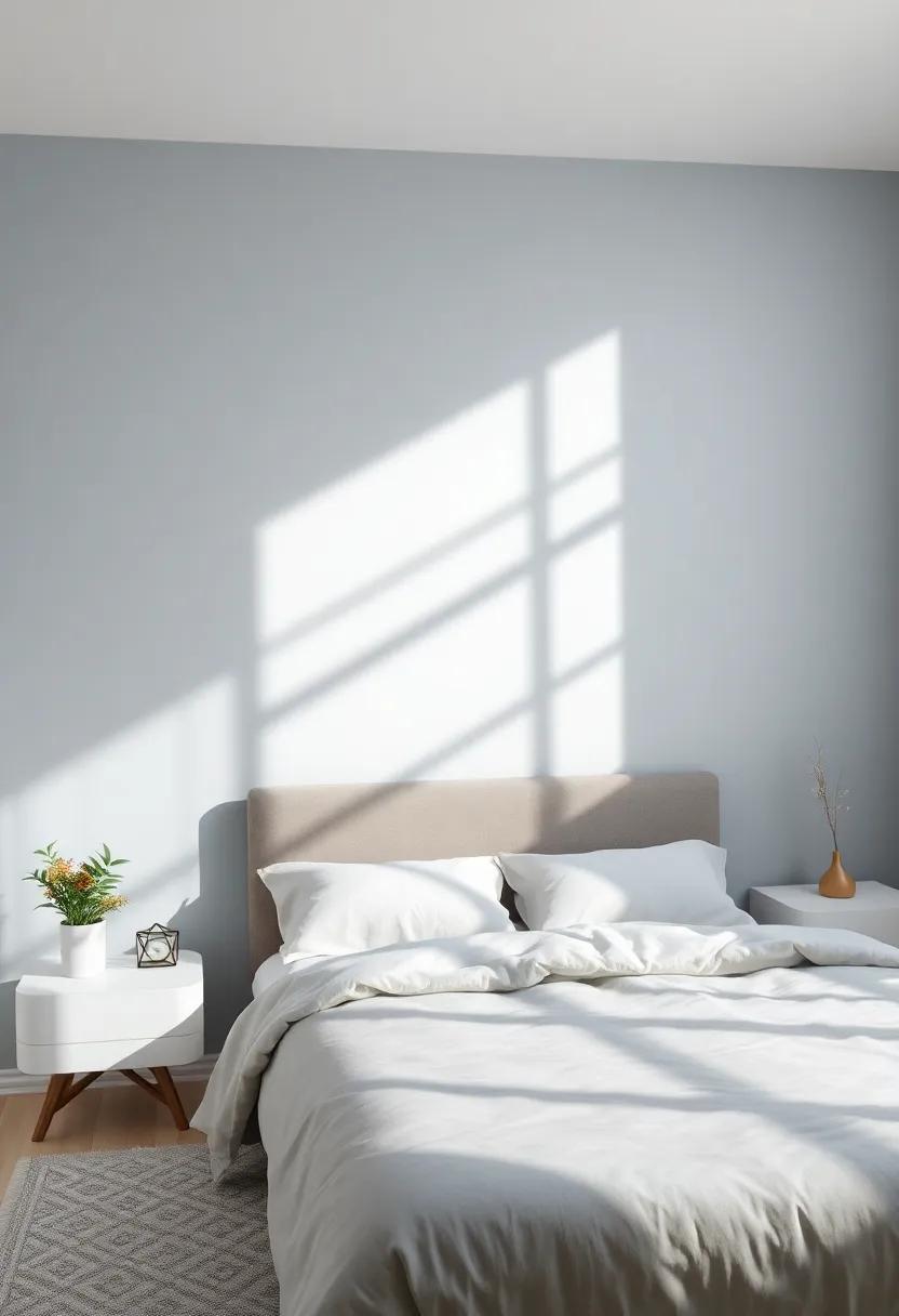
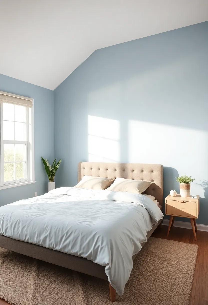
Serenity in shades: the Calming Effects of Soft Blues and Greens
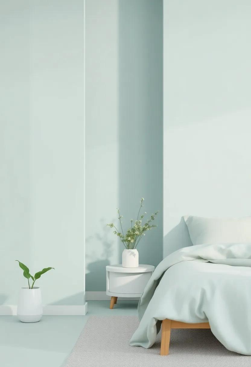
Incorporating soft blues and greens into your bedroom can transform the atmosphere into a serene retreat, offering a sense of calm and tranquility.These hues evoke the soothing qualities of nature, reminiscent of wide-open skies and lush landscapes. Their gentle presence can help reduce stress and create a restorative environment where relaxation thrives. When selecting these colors, consider using a palette that includes:
- Pale Blue: Perfect for promoting restful sleep.
- Mint Green: Creates a refreshing and airy feel.
- Seafoam: Merges blue and green for a coastal vibe.
- Sage: Adds a muted elegance that harmonizes well with neutrals.
These tranquil shades can be successfully incorporated through paint, bedding, or decor accessories. To help visualize your options, here’s a simple color comparison chart:
| Color | effect | Best Paired With |
|---|---|---|
| Pale Blue | Calming and relaxing | white or soft grays |
| Mint Green | Refreshing and invigorating | Coral or light beige |
| Seafoam | Soothing and tranquil | Warm woods or natural textures |
| Sage | Muted elegance | Soft gold or creamy whites |
By experimenting with these soothing colors, you can create a cozy retreat that not only reflects your personal style but also enhances your overall well-being, making your bedroom a true sanctuary.
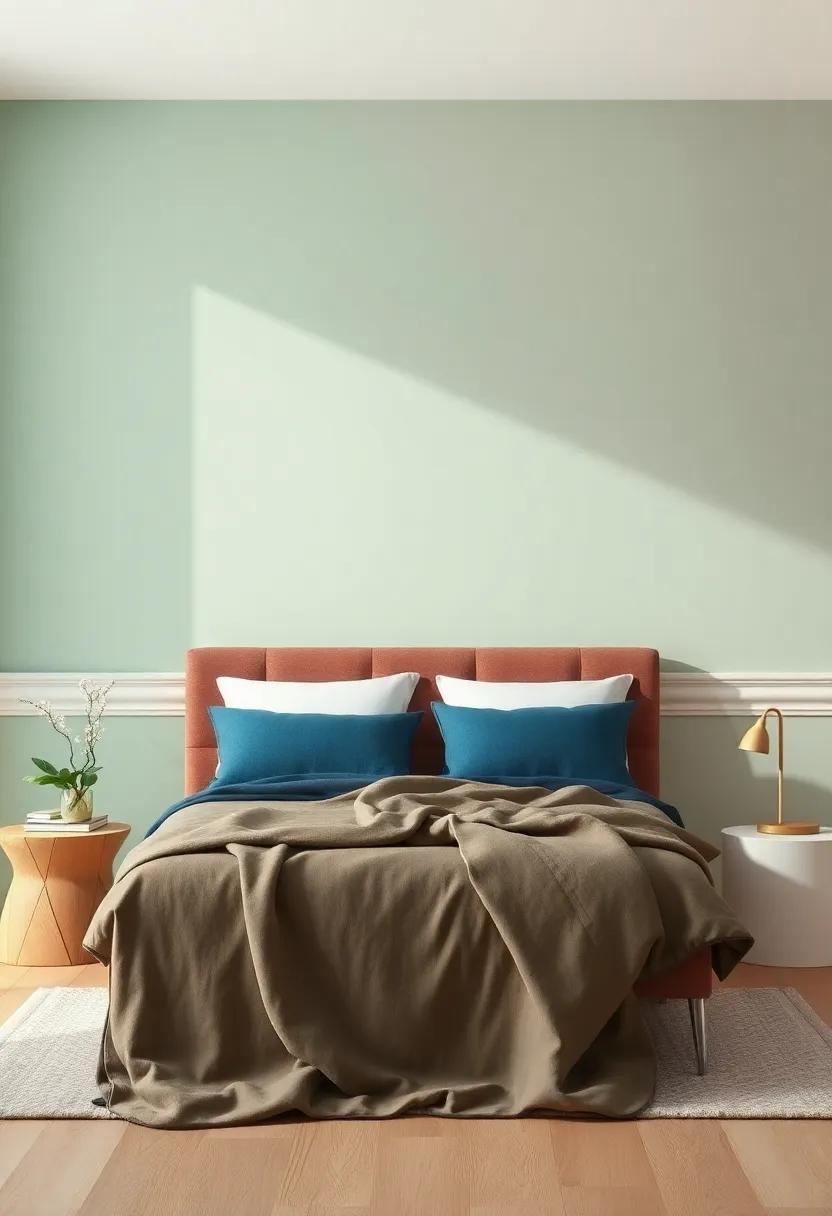
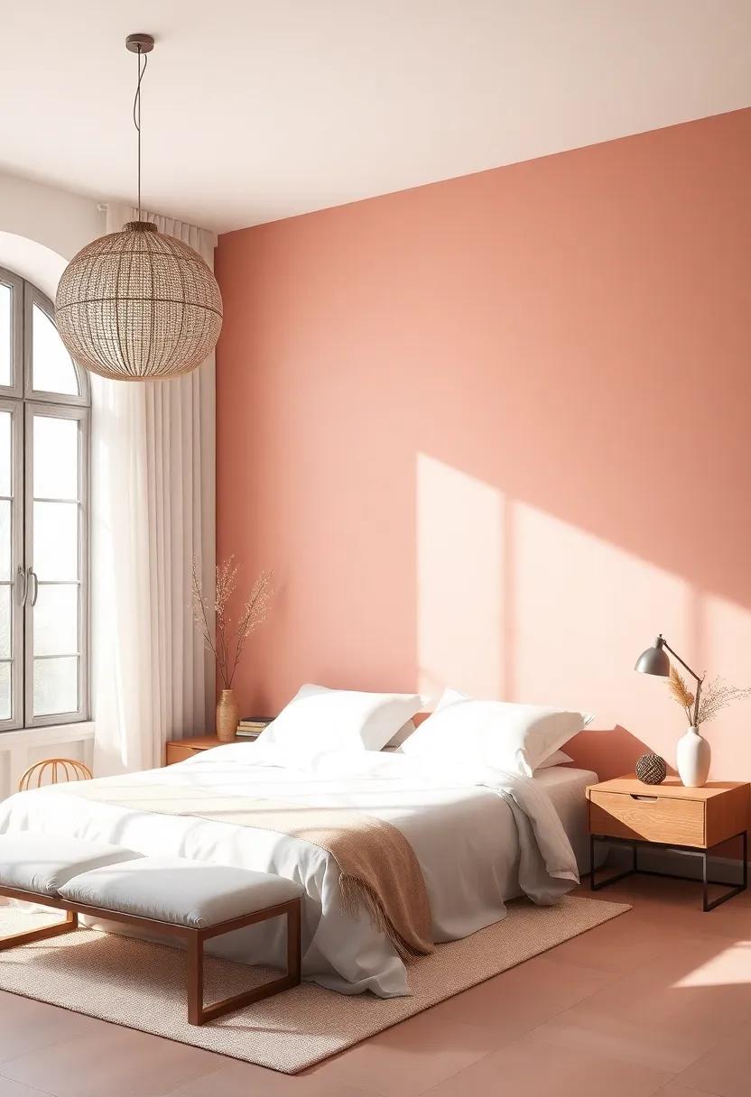
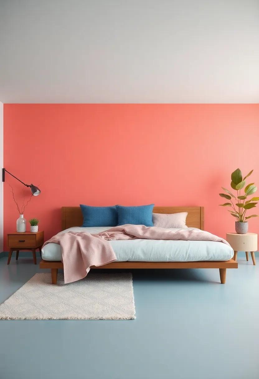
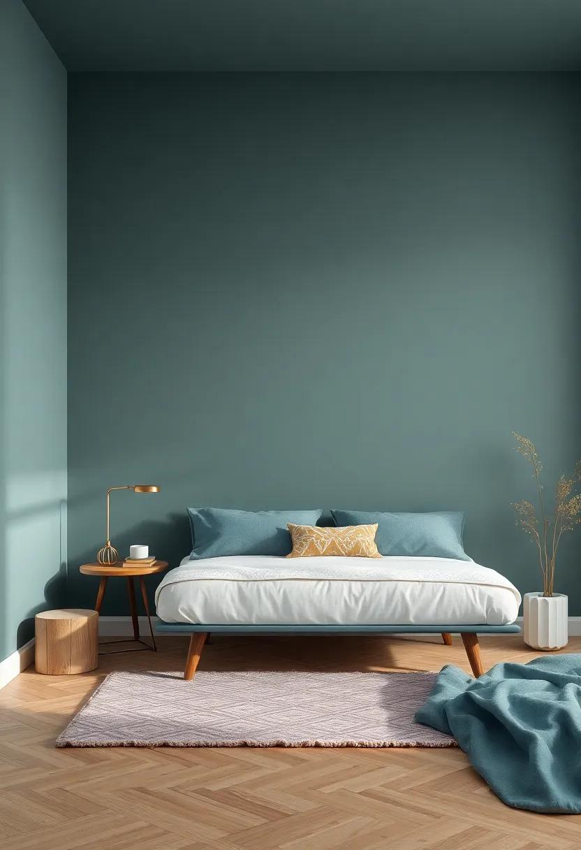
Bold Statements: Embracing Deep and Rich Colors for a Cozy Atmosphere
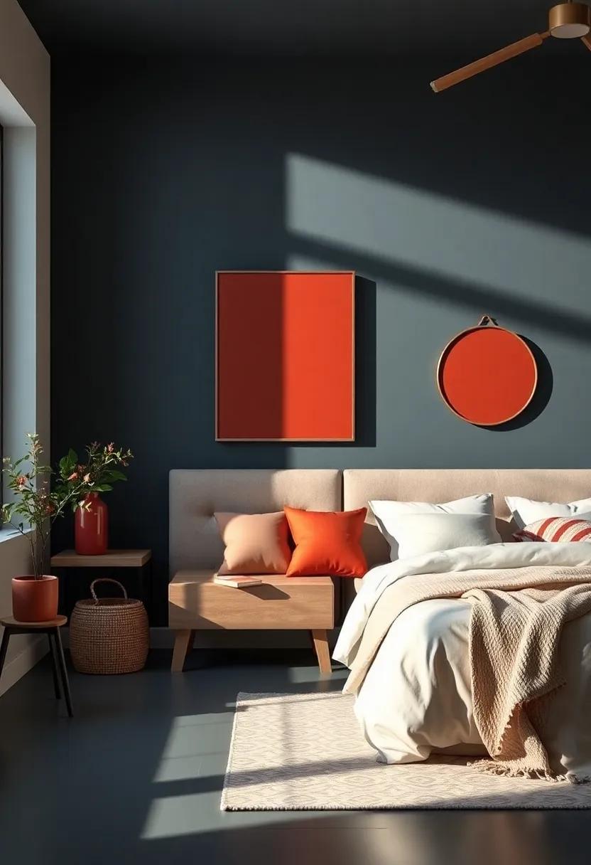
Transforming your bedroom into a cozy retreat can be effortlessly achieved by opting for deep, rich colors that envelop the space in warmth. Shades such as emerald green, navy blue, or burgundy not only create an inviting ambiance but also evoke feelings of tranquility and comfort.These colors serve as a perfect backdrop for various decor, allowing natural materials, soft textiles, and warm lighting to enhance the inviting atmosphere. A bold accent wall, painted in a sumptuous hue, can be the focal point that draws the eye and sets the mood for relaxation.
In addition to the main color palette, consider incorporating complementary shades through accents and furnishings.Some options include:
- warm golds or brass accents for a touch of luxury
- Soft creams or whites to balance darker hues
- Earthy tones like terracotta for grounding elements
To guide your decisions on color combinations, refer to the table below showcasing harmonious pairings that enhance a cozy vibe:
| Base Color | Complementary Color | Accent Color |
|---|---|---|
| Emerald Green | Muted Gold | Blush Pink |
| Navy Blue | Soft Gray | Warm White |
| Burgundy | Cream | Slate Blue |
Warm Neutrals: Creating Comfort with Earthy Tones and Creamy Whites
Exploring the spectrum of warm neutrals can transform your bedroom into a serene haven. These earthy tones, when paired with creamy whites, create a natural palette that brings an inviting warmth to your space. Consider incorporating shades such as soft taupe, warm beige, or muted taupe, which exude a sense of calmness. These colors work harmoniously to create a backdrop that is both relaxing and complex, allowing you to unwind after a long day. Accent these with crisp white trim to add a touch of brightness and delineation, enhancing the overall aesthetic of your cozy retreat.
To further enhance the comforting atmosphere, think about integrating various textures and materials that complement your chosen color palette. Utilizing natural wood finishes, plush textiles, and earthy decor elements can create depth and interest.Here are some tips to consider:
- Layer Textiles: Use soft throw blankets and cushions in similar warm neutral shades.
- Introduce Wood Elements: Opt for furniture or decor in light to medium wood tones for a rustic touch.
- add Greenery: Incorporate indoor plants to infuse life and color that complements warm tones.
The Power of Accents: How a Pop of Color Can revitalize Your Space
Incorporating a splash of color into your bedroom can work wonders for the overall ambiance and aesthetic of your sanctuary. By choosing vibrant accent shades, you can create focal points that draw the eye and elevate the mood of your space. A soft, muted base color on the walls can serve as a perfect backdrop for bolder hues on furnishings, textiles, and decorative items. Consider introducing color through:
- Pillows and Throws: Radiant cushions can instantly add warmth and personality.
- Artwork: A colorful piece can serve as a stunning centerpiece.
- Accent Furniture: A vivid chair or bedside table can inject life into neutral decor.
Furthermore,the strategic use of color can influence not only the aesthetic but also the emotional tone of your bedroom. Colors have unique properties that can evoke different feelings, helping you to tailor your retreat to suit your personal vibe. Pairing calm shades like blue and green with cheerful accents like yellow or coral can create a balanced yet dynamic environment. Explore how various color combinations interact to enhance your personal space through a simple color palette table:
| Base Color | Accent Color | Emotion Evoked |
|---|---|---|
| Soft Gray | Mustard Yellow | Warmth & Comfort |
| Sage Green | Coral | Fresh & Inviting |
| Powder Blue | Peach | Serenity & Cheer |
Layering shades: The Art of Combining Different Colors for Depth
Creating a visually dynamic bedroom involves the careful layering of colors to evoke warmth and intimacy. Start by selecting a primary color that resonates with you, setting the mood for your cozy retreat. From there, introduce secondary colors that either complement or contrast the base shade, adding depth and interest. Some effective combinations include:
- Soft blues and warm taupes for a serene, tranquil space.
- muted greens and rich earth tones to bring nature indoors.
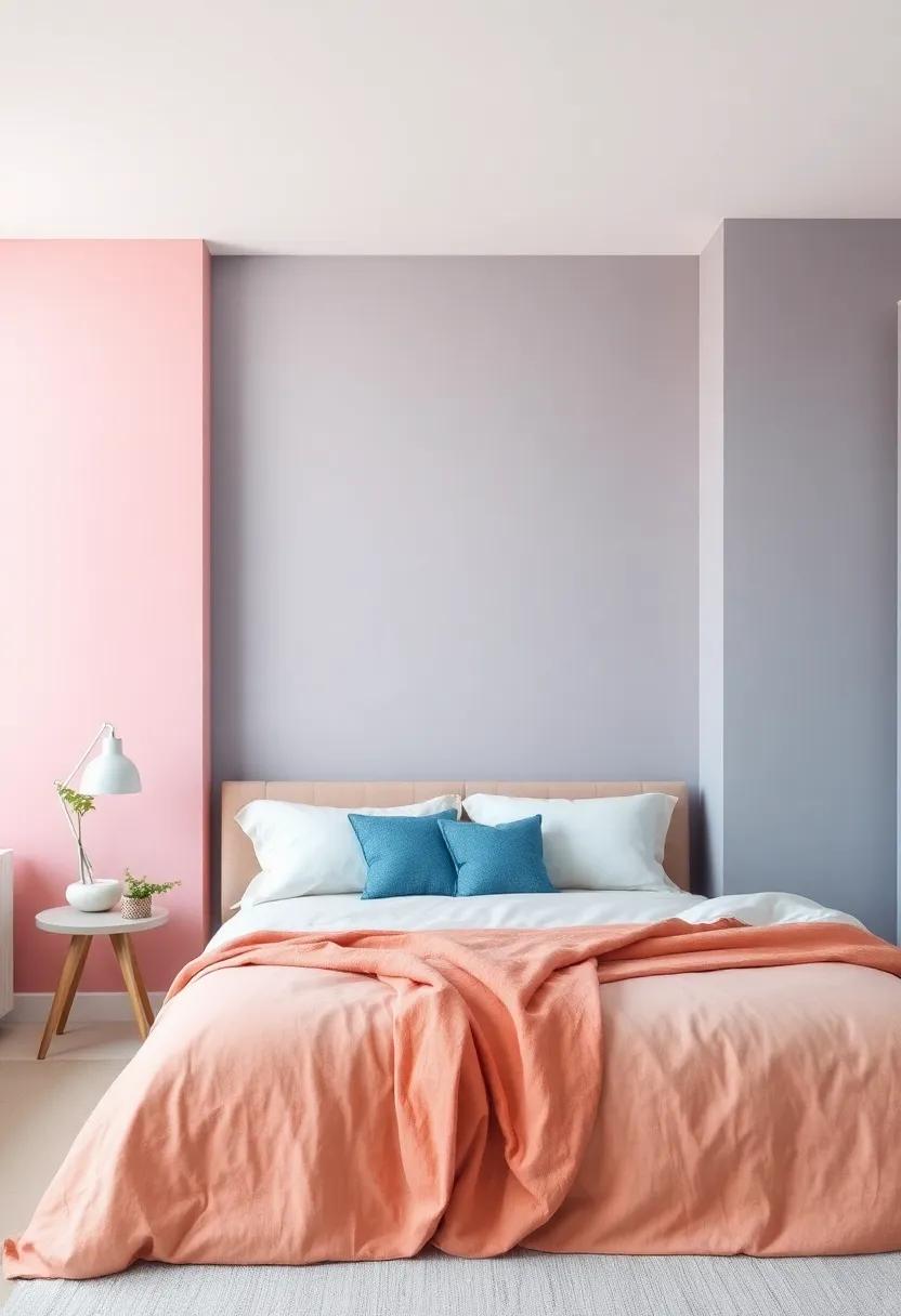
- Dusty pinks paired with charcoal grays for a modern yet inviting feel.
For added dimension,consider using accent walls or painted furniture in bolder tones that draw the eye and create focal points within the room. A well-placed table or shelf can serve as a perfect canvas for these bold shades, enhancing your overall design approach. To help visualize your options, refer to the following color pairing chart:
| Primary Color | Complementary Accent | Suggested finish |
|---|---|---|
| Soft Lavender | Deep Plum | Satin |
| Light Gray | Charcoal | Matte |
| Warm Beige | Rust Red | Glossy |
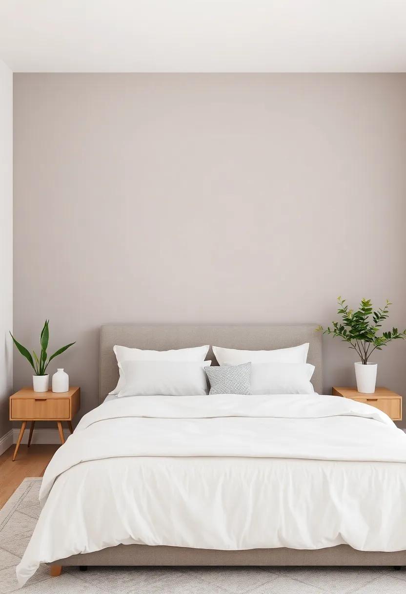
Timeless Elegance: The Charm of Classic Greys and Whites in Modern Decor
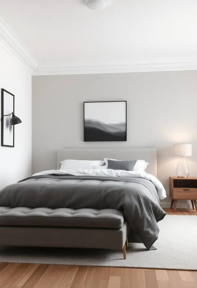
In the realm of interior design, the use of classic greys and whites embodies a sense of serenity and sophistication.These timeless hues create a harmonious backdrop,allowing for the introduction of different textures and accent colors.The versatility of gray,ranging from soft dove to deep charcoal,pairs beautifully with crisp whites that enhance the light in a space,making it feel larger and more inviting. Consider integrating these shades through:
- Painted Walls: Opt for a muted grey to infuse warmth while maintaining elegance.
- Textiles: Choose white linens or curtains to add a layer of softness.
- Furniture: Select grey upholstered pieces that can serve as focal points without overwhelming the room.
Incorporating classic greys and whites into your bedroom decor not only fosters a cozy ambiance but also allows for creativity in styling. Accessories in complementary tones can add visual interest and personality. A well-placed gallery wall featuring monochromatic art can create a stunning focal point, while textural elements, such as soft throws or patterned rugs in these shades, can enhance warmth and comfort. To illustrate the impact of these colors, consider the following:
| Element | Best Shade |
|---|---|
| Walls | Soft Grey |
| Trim & Molding | Bright White |
| Accent Pieces | Charcoal |
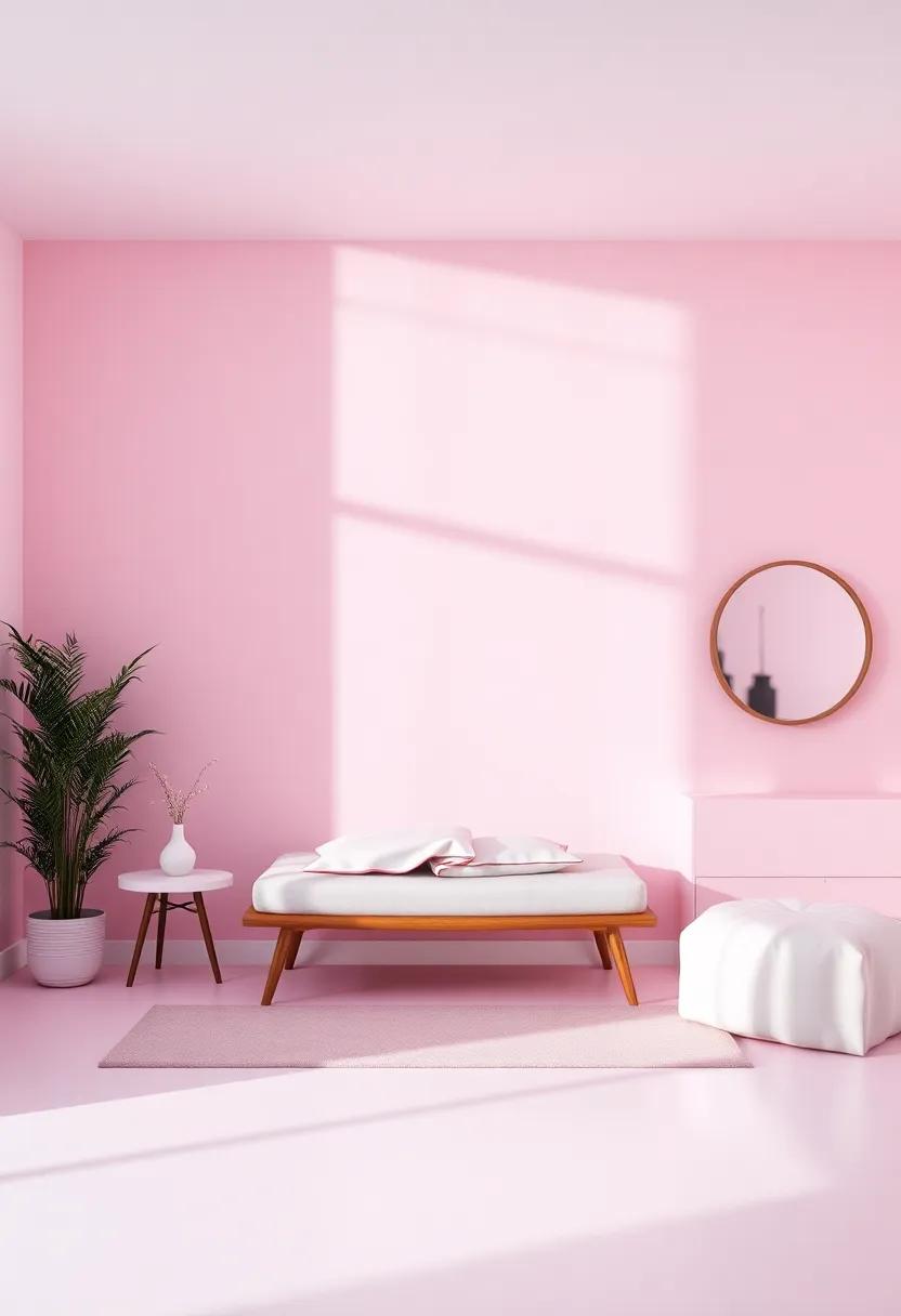
Playful Pastels: Infusing Cheerfulness into your Bedroom with Soft Colors
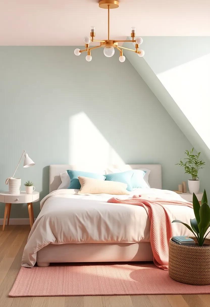
Soft hues can work wonders in creating an atmosphere of calm and joy in your bedroom. By incorporating playful pastels, you can instantly uplift the overall mood, transforming a standard space into a whimsical retreat. Imagine awakening to the gentle blush of powder pink or the serene light blue that mimics a clear sky. these colors are not just pleasing to the eye; they also create a sense of openness and tranquility. Combine these shades with natural light to enhance their effect, allowing the playful tones to dance around the room throughout the day.
To achieve a harmonious look, consider pairing your pastel walls with complementary accents. Think about incorporating elements like soft-gray bedding, neutral furniture, or floral patterns in muted colors. Here’s a simple table to visualize some engaging pastel combinations:
| Accent Color | Complementary pastel |
|---|---|
| Soft Gray | Powder Pink |
| Cream | Pale mint |
| Navy Blue | Light Lavender |
These combinations not only enhance the aesthetic appeal of your bedroom but also create a snug and inviting atmosphere, perfect for relaxation and recharging. By infusing your space with these charming pastel shades, you’ll find yourself looking forward to stepping into your bedroom, a cozy haven painted in hues that bring a smile to your face.
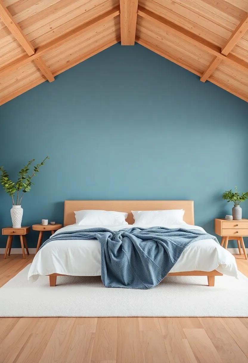
Nature-Inspired Palettes: bringing the Outdoors In with organic Hues
Embracing earthy tones and organic hues can transform your bedroom into a serene sanctuary, echoing the beauty of the natural world. These colors often evoke feelings of tranquility and comfort, making it easy to unwind and relax. Imagine waking up surrounded by soft, muted shades inspired by a lush forest or a tranquil beach. Consider integrating hues such as:
- Warm Sand – A neutral beige that radiates warmth and calm.
- Forest Green – A deep, grounded color promoting peace and relaxation.
- Sky Blue – Evoking the vastness of the sky, ideal for creating an open, airy feel.
- Stone Grey – A versatile shade that brings sophistication and a touch of nature indoors.
To further enhance your cozy retreat, consider adding textures that harmonize with your chosen palette. Soft linens, wooden accents, and natural fibers can complement the organic hues beautifully. A mix of materials can introduce depth while tying in the outdoor inspiration. Here’s a quick reference table for pairing colors and textures:
| Color | Recommended Textures |
|---|---|
| Warm Sand | Soft Cotton, Woven Rugs |
| Forest Green | Knitted Throws, Natural Wood |
| sky Blue | Linen Drapes, Rattan Accents |
| stone Grey | Velvet Pillows, Marble Decor |
Mood Lighting: The Role of Light in Enhancing Bedroom Colors
Light is a powerful tool in interior design, especially in the bedroom where a calming atmosphere is paramount. The color palette you choose can considerably shift in mood depending on the type and intensity of lighting used.Warm, soft lights can amplify subtle hues like soft blues or gentle greens, creating an inviting space that promotes relaxation and restful sleep. In contrast, cooler, brighter lights can bring out the vibrancy in bolder colors such as deep reds or rich purples, allowing them to energize the room. Understanding how light interacts with paint colors can help you craft the perfect ambiance.
To effectively leverage light for mood enhancement, consider the following elements:
- Layering Lighting: Utilize a combination of overhead lighting, bedside lamps, and accent lights to establish depth and dynamism.
- Bulb Temperature: Choose soft white bulbs (2700K-3000K) for a warm glow or daylight bulbs (5000K) for a bright and energizing effect.
- Reflective Surfaces: Incorporate mirrors and glossy finishes to bounce light around the room and enhance colors.
- dimmers: Installing dimmer switches allows you to adjust brightness levels to suit your mood throughout the day.
Below is a simple reference table showing colors and their recommended lighting:
| Paint Color | Recommended Lighting |
|---|---|
| Soft Blue | warm Soft Light |
| Muted Green | Soft White Bulbs |
| Deep Burgundy | Cool White Bulbs |
| Pale Lavender | Bright Adjustable Lights |
Cultural Influences: Traditional Color Schemes from Around the World
Color schemes not only enhance the aesthetic appeal of a bedroom but also evoke emotions tied to different cultures. When selecting hues, consider the vibrant and soothing palettes inspired by various traditions. For instance, in japan, the use of soft pastels—such as cherry blossom pink and pale blue—reflects the country’s connection to nature and seasonal changes. In contrast,the earthy tones seen in Mediterranean style—terracotta,warm yellows,and ocean blues—are celebrated for creating a serene atmosphere reminiscent of sun-soaked coastlines.
Explore additional color influences that add character to your personal sanctuary. Here are some cultural palettes that can transform your space into a cozy retreat:
- Scandinavian: Cool grays, whites, and pops of muted pastels promote simplicity and warmth.
- Indian: Rich jewel tones like deep purple, gold, and burgundy give a vibrant, luxurious feel.
- African: Deep reds, earthy browns, and shades of green enhance a warm and grounded atmosphere.
- Chinese: Use vibrant reds and golds for a sense of prosperity and joy.
| Culture | Key Colors | Emotional Impact |
|---|---|---|
| Japanese | Soft pastels | Calming, peaceful |
| Mediterranean | Earthy tones | Warm, inviting |
| scandinavian | Cool grays, whites | Simple, cozy |
| Indian | Jewel tones | Luxurious, vibrant |
Personal Reflections: Choosing Colors that Resonate with Your Individual Style
choosing the right colors for your sanctuary involves more than just aesthetic appeal; it reflects your personal style and influences the overall vibe of your space. Consider the emotions and feelings that various colors evoke: blues can bring a sense of calm, greens can create a refreshingly natural ambiance, and warm tones like terracotta or gold can add an inviting warmth. Think about how you want your bedroom to feel at the end of the day. Creating a mood board with swatches or even paintings can help visualize how these colors resonate with your vision. Don’t forget to factor in the lighting in your room, as it can dramatically change how a color looks throughout the day.
When selecting your colors, try to focus on a palette that feels authentic to you. Here are a few ideas to spark inspiration:
- Monochromatic Schemes: Utilize varying shades of a single color, creating depth and interest.
- Complementary Colors: Pair colors opposite on the color wheel to evoke vibrant energy.
- Nature-Inspired Palettes: Consider earthy tones that mimic natural landscapes for a soothing effect.
Experimenting with accent walls or decorative pieces in your chosen color can further enhance your room’s personality. Ultimately, the goal is to create a cozy retreat that feels uniquely yours and invites restful rejuvenation at the end of the day.
Seasonal Swaps: Adapting Your Bedroom’s Color Scheme Throughout the Year
As the seasons change, so too can the mood and atmosphere within your bedroom. Spring invites fresh, vibrant shades that reflect renewal and growth. Consider hues like soft pastels, mint green, and sky blue. These colors create a light,airy environment,perfect for welcoming in the warm weather. Transitioning into summer, deeper tones of coral, seafoam, or even a bright yellow can bring a cheerful vibrancy to your space, evoking those sunny days and endless possibilities. As the heat of the season lingers, these energizing colors can keep your room feeling lively and invigorating.
When autumn rolls in, it’s time to embrace richer, warmer tones. Embellish your walls with burnt orange, rusty reds, or golden yellows to cultivate a cozy atmosphere reminiscent of falling leaves. as winter draws close, opt for deeper colors like navy blue, forest green, or a soothing charcoal gray to provide a sense of coziness and refuge against the cold. The combination of darker colors with soft, warm accent lighting can transform your space into a snug retreat, making your bedroom the ultimate sanctuary during those chilly months.
Textures and Fabrics: Complementing Paint colors with Bedding Choices
Choosing the right textures and fabrics for your bedding can significantly enhance the overall feel of your bedroom while complementing your paint colors.Opt for materials that harmonize with the mood you wish to create. As a notable example, if your walls are painted in soft pastels, consider lightweight linens or cotton blends that add a touch of softness and lightness. Conversely, deep jewel tones call for elements like velvet or microfiber to elevate the richness of your space. Additionally, mixing textures can add depth to your design; think about layering a chunky knit throw over a smooth duvet to create a cozy retreat.
When incorporating colors and patterns into your bedding, focus on complementing your paint hues for a cohesive look. Here are some combinations to consider:
| Paint Color | Bedding Texture | Bedding Color/Pattern |
|---|---|---|
| Soft Blue | Linen | White with Navy Stripes |
| Warm Taupe | Flannel | Earthy Tones with Floral Print |
| Bright Coral | Cotton | Soft Gray with Geometric Patterns |
| Deep Forest Green | Velvet | Rich Gold Accents |
By selecting bedding that not only fits your personal style but also works in harmony with your paint choices, you create a welcoming atmosphere.Don’t shy away from experimenting with bold patterns or textures; they can turn your bedroom into a snug haven, perfectly tailored for relaxation and rejuvenation.
Beyond Paint: Artistic Wall Treatments to Enhance Your Bedroom Aura
When seeking to elevate your bedroom’s ambiance, consider the wonders of artistic wall treatments that go beyond mere paint. Techniques such as textured finishes, stenciling, and wall decals can transform the ordinary into the extraordinary. For instance, faux plaster or rustic wood paneling can add depth and warmth, while a carefully placed mural can evoke a serene landscape, sweeping you into tranquility every time you enter your retreat. Select colors that harmonize with your theme,creating a cohesive look that enhances your personal style.
Another fabulous approach is the incorporation of fabric wall treatments, such as tapestry or upholstered panels, which not only provide warmth but also contribute to sound absorption, creating a peaceful environment.Consider layering these fabric elements with contrasting textures like velvet or linen for a more dynamic visual appeal. Here’s a sample table to inspire your choices:
| Technique | Effect | Best Colors |
|---|---|---|
| Textured Finish | Adds depth and character | Earthy tones, muted pastels |
| Stenciling | Creates unique focal points | Bright accent colors, white |
| Fabric Panels | Softens sound and adds warmth | Neutral shades, jewel tones |
Color Psychology: understanding how Different Hues Influence Mood
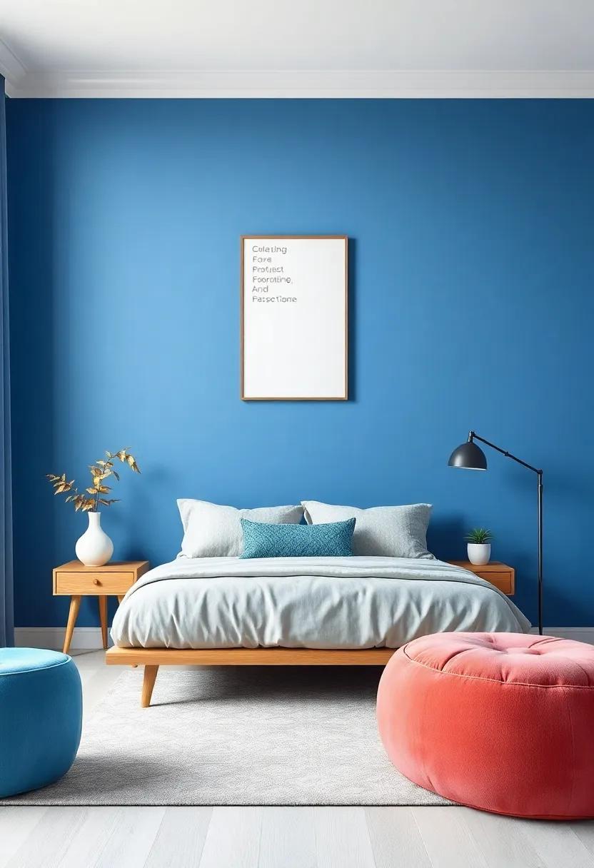
Colors have a profound impact on our emotions and state of mind, making them an essential factor in designing your ultimate bedroom retreat. Warm hues, such as red, orange, and yellow, can evoke feelings of energy and warmth. However,using these shades in moderation can create a cozy atmosphere without overwhelming the senses. In contrast, cool colors like blue, green, and lavender are known for their calming effects, promoting relaxation and tranquility. These colors can transform a bedroom into a serene oasis where stress fades away, allowing for restful nights and peaceful mornings.
When selecting the perfect paint for your bedroom, consider how different shades can work in harmony with lighting and decor choices. Here are some ideal combinations to inspire your redesign:
- Soft Blue – Creates a peaceful environment, perfect for unwinding.
- warm Taupe – Offers a soft, comforting feel that complements various accents.
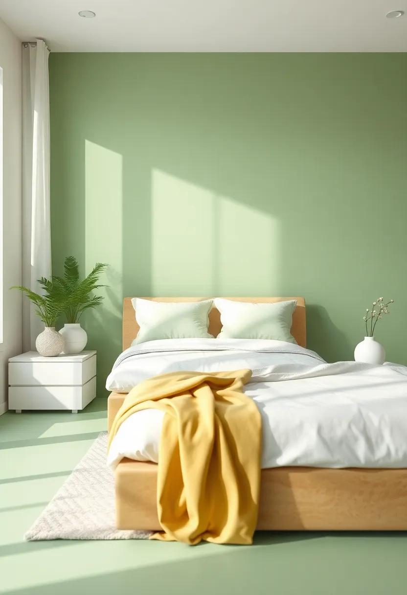
- Muted Green – infuses nature-inspired calmness, ideal for promoting rest.
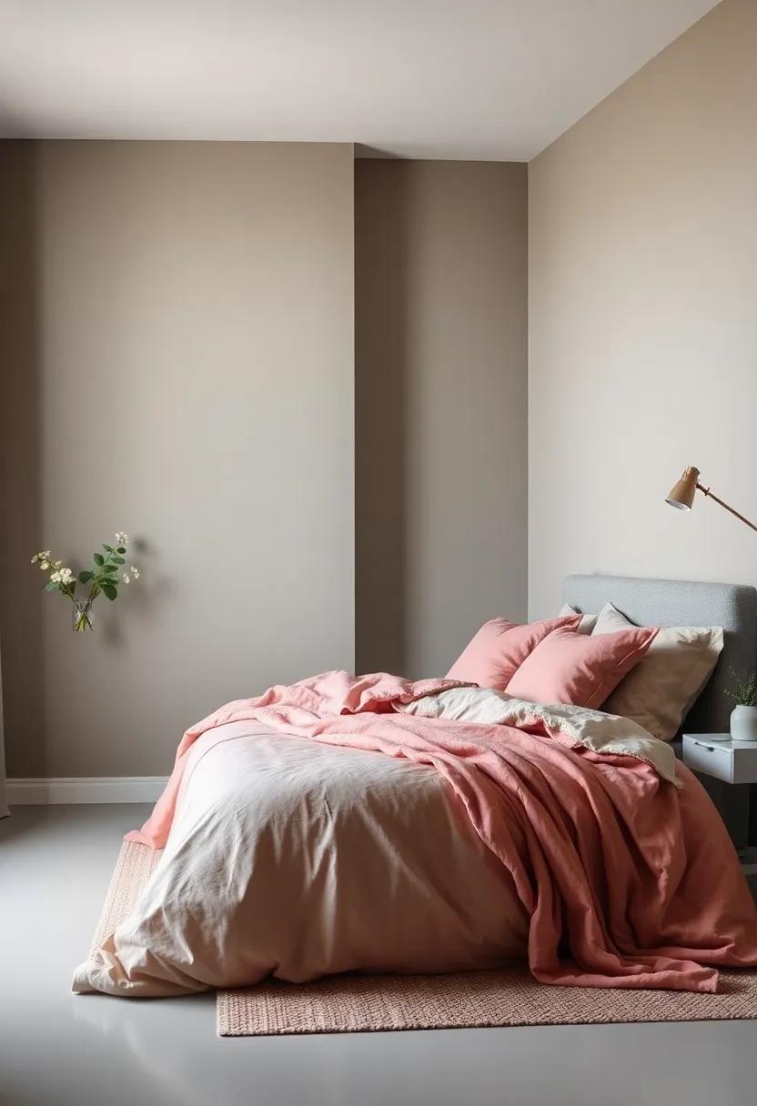
- Dusty Rose – Adds a touch of warmth while maintaining a soft elegance.
| Color | Mood Influence | Best Paired with |
|---|---|---|
| Soft blue | Calm & Focused | White or Light Gray |
| Warm Taupe | Cozy & Inviting | Deep Brown or Cream |
| Muted Green | Refresh & Revitalize | Natural Wood or Soft White |
| Dusty Rose | Warmth & Comfort | Gold Accents or Cream |
Creating Focal Points: using Color to Highlight Architectural Features
color is a powerful tool in interior design, especially when it comes to emphasizing the unique characteristics of a bedroom. Using thoughtful color choices can create focal points that draw the eye and enhance the overall ambiance. Consider the following methods to strategically apply color for impact:
- Accent walls: Paint one wall a bold hue that contrasts with the others,making it a centerpiece that highlights architectural features such as windows or alcoves.
- Trim and moldings: A contrasting color on trims can outline the features of a room, providing visual interest and depth.
- Furniture Pieces: Use vibrant colors on key furniture pieces,such as a headboard or nightstand,to create an eye-catching element in your sanctuary.
To achieve a cohesive look, it’s essential to consider the color palette as a whole. Here are some color combinations to inspire:
| Color Pairing | Effect |
|---|---|
| Soft Blue & White | Create tranquility and spaciousness |
| Warm Taupe & Olive Green | Add cozy warmth and earthiness |
| Deep Navy & Gold | Introduce luxury and depth, perfect for a statement room |
Sustainable Choices: Eco-friendly Paint Options for a Healthy Retreat
When creating a peaceful sanctuary in your bedroom, selecting an eco-friendly paint can enhance the atmosphere while promoting sustainability. Many innovative brands now offer low-VOC (volatile organic compounds) and zero-VOC paints that reduce harmful emissions, contributing to better air quality. Consider options like natural mineral paints, which use earth-derived pigments and natural binders, or milk paints, composed of casein and clay, providing a lovely, matte finish without the chemical load. By choosing these alternatives, you can create a cozy retreat that is as healthy for the environment as it is indeed for your well-being.
In your quest for the perfect color palette, check out some of the leading eco-friendly paint options available today:
| Brand | Type | Features |
|---|---|---|
| Behr Premium Plus | Low-VOC | Durable, mildew-resistant finish |
| Farrow & Ball | Eco-friendly | Rich pigment, sustainable ingredients |
| Clare | Zero-VOC | All-in-one paint and primer, easy to apply |
By integrating these sustainable choices into your bedroom project, you not only contribute to a healthier living environment but also add an aesthetic that resonates with natural, calming vibes. Opt for colors that reflect serene landscapes—soft greens, warm taupes, and gentle blues—paired with eco-friendly finishes, such as clay or chalk paint, which can further amplify the retreat-like feel of your space.
Visual Cohesion: Harmonizing Colors Throughout Your Living Space
To create a harmonious atmosphere in your bedroom, it’s essential to select paint colors that not only resonate with your personal style but also complement each other seamlessly. Consider implementing a color palette that blends multiple shades, allowing for greater flexibility and flow throughout the space. some compelling combinations include:
- Soft Blues and Greys: Evoke a tranquil ambiance, perfect for relaxation.
- Warm Neutrals: Create a cozy, inviting feel that pairs well with various accent colors.
- Muted Earth Tones: Bring the outdoors in, providing a grounding effect that enhances harmony.
- Pastel Accents: Add a touch of whimsy while maintaining a serene overall look.
Beyond just selecting colors,it’s crucial to maintain visual cohesion through the integration of other elements within the room. consider how furniture,textiles,and accessories can echo your chosen palette. For example, incorporating a patterned throw that features your wall color or using bedding that highlights your accent shades can dramatically connect your design choices. To help visualize how these colors can work together, refer to the table below:
| Color Scheme | Primary Color | Complementary Accents |
|---|---|---|
| Calm Retreat | Soft Blue | Soft Grey, White |
| Cozy Haven | Warm Taupe | Burnt orange, Cream |
| Nature’s Embrace | Muted olive | Peach, Terracotta |
| Serene Bliss | Dusty Lavender | Mint Green, Soft Pink |
Experimenting with Patterns: The Impact of Prints and Textures in Design
In the realm of interior design, the use of prints and textures can dramatically alter the perception and atmosphere of a space. When selecting paint colors for a cozy bedroom retreat,incorporating patterned elements and varied textures allows you to add depth and interest. Consider fabrics like velvet or linen for bedding and curtains that complement your wall color. A strategically placed accent wall with geometric or floral patterns can introduce an invigorating contrast that draws the eye and creates a focal point, enriching the overall design aesthetic.
Moreover, the interplay of different materials can enhance the comfort level of your sanctuary. Using a mix of finishes, such as matte wall paint paired with shiny satin or gloss furnishings, adds layers that invite tactile exploration.Think about integrating a cozy area rug, complemented by textured pillows and throws, to create an inviting ambiance.here’s a quick overview of how prints and textures can harmonize in your bedroom:
| Element | Impact |
|---|---|
| Wall Color | Sets the mood: warm tones for coziness, cool tones for calm. |
| bed Linens | Add softness and visual intrigue with textures. |
| Rugs | Define spaces and add warmth underfoot. |
| Artwork | Introduce personal expression and visual appeal. |
Creating Your Sanctuary: Designing a Bedroom That Reflects Your Personal Haven
To create a bedroom that truly embodies your personal sanctuary, consider incorporating colors that evoke warmth and tranquility. Soft neutrals like beige and taupe can serve as a calming backdrop,allowing you to experiment with bolder accent hues through decor and textiles. Shades of misty blue or gentle green can bring the serenity of nature indoors, fostering a sense of peace that encourages relaxation.As you choose your paint colors, don’t forget to think about the emotional response each shade elicits, as a color palette in harmony with your personality can transform your space into a restorative haven.
Your bedroom is not just a place for sleep; it can be a reflection of your unique style and passions. Consider adding textures that complement your chosen color palette. Here are a few ideas to enhance the aesthetic:
- Textured Throws: Layer soft blankets in various materials and patterns.
- accent Pillows: Use decorative pillows in color-coordinated fabrics for added comfort.
- Artwork: Choose pieces that resonate with you and increase visual interest.
In addition, organizing your space with functional yet stylish furniture can contribute to the overall ambiance. Below is a simple layout that incorporates essential elements for your sanctuary:
| Essential Elements | Purpose |
|---|---|
| Bed Frame | Creates the main focal point |
| Nightstands | Offers convenience and balance |
| Reading Nook | Encourages relaxation and leisure |
Transformative Experiences: How Color Adaptations Can Uplift Your Daily Life
Incorporating color adaptations in your bedroom can transform your space into a serene retreat that promotes relaxation and comfort. Selecting the right hues can not only alter the mood of the room but also enhance your daily life by creating an atmosphere tailored to your personal preferences. Consider shades such as soft blues for a calming effect, lush greens to evoke a sense of nature, or warm beiges that provide a cozy, inviting feel. each color palette has unique qualities that can uplift your daily experience:
- Soft Blues: Known for their cooling properties, perfect for inducing sleep.
- Lush Greens: Foster a connection to the outdoors, promoting tranquility.
- Warm Beiges: create a soothing environment that feels both modern and timeless.
To further illustrate the impact of these colors, consider our suggested palette options summarized below:
| Color | Vibe | Best Paired With |
|---|---|---|
| Soft Blue | Calming | White Accents |
| Lush Green | Nurturing | Natural Wood |
| Warm Beige | Cozy | Earthy Tones |
Choosing the right color can transform not only your physical environment but also elevate your emotional well-being, making your bedroom a true retreat from the bustle of everyday life. So embrace the power of paint, and let your bedroom become the sanctuary you’ve always desired.
Tranquil Retreats: designing a Bedroom Atmosphere that Promotes Relaxation

Creating a bedroom that embodies tranquility starts with the choice of color. soft,muted tones can transform your space into a soothing sanctuary. Consider shades like powder blue, gentle sage, or warm taupe. These colors not only promote relaxation but also create a harmonious atmosphere. When selecting your paint, think about how the light interacts with your chosen hue throughout the day; natural light can enhance lighter shades, while soft lighting can make deeper tones feel more inviting.
To complement your new color palette, consider integrating elements that enhance the overall serenity of your bedroom. Here are some key features to incorporate:
- Layered Textiles: Use soft bedding, plush rugs, and cozy throws for added comfort.
- Natural Materials: Woods and stones can add a grounding element to the design.
- Personal Touches: Display art or photographs that elicit positive emotions.
In Conclusion
As you embark on your journey to transform your bedroom into a cozy retreat, remember that the right paint color can do wonders for your space and your mood. Whether you opt for the calming hues of soft blues and greens or the warm embrace of earthy tones, each shade can create an atmosphere that reflects your personality and invites relaxation. take the time to experiment and envision how each color will interact with your furnishings and natural light. Ultimately, your bedroom should be a sanctuary that embodies comfort and peace—a personal oasis where you can unwind after a long day. So, grab that brush and palette. Let your imagination flow and create the dream space you’ve always desired. Happy painting!
As an Amazon Associate I earn from qualifying purchases.